國立傳統藝術中心
廖瓊枝歌仔戲
National Center for Traditional Arts
Liao Chiung-Chih's Taiwanese Opera
package design, graphic design, editionrial, culture
2018
Art Director
余岱官 Kuan
Designer
余岱官 Kuan(包裝結構)
高懷瑾(視覺)
Photography
高懷瑾
廖瓊枝歌仔戲
National Center for Traditional Arts
Liao Chiung-Chih's Taiwanese Opera
package design, graphic design, editionrial, culture
2018
Art Director
余岱官 Kuan
Designer
余岱官 Kuan(包裝結構)
高懷瑾(視覺)
Photography
高懷瑾
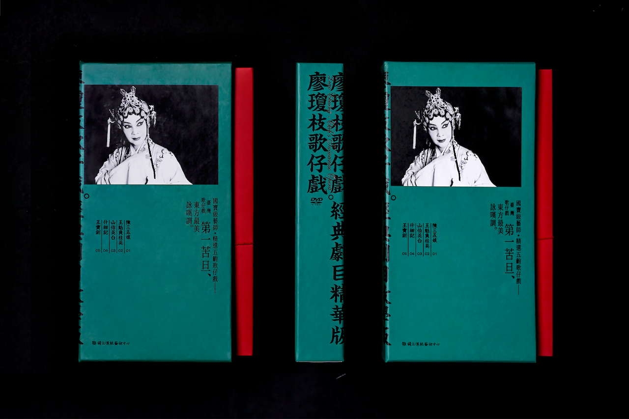
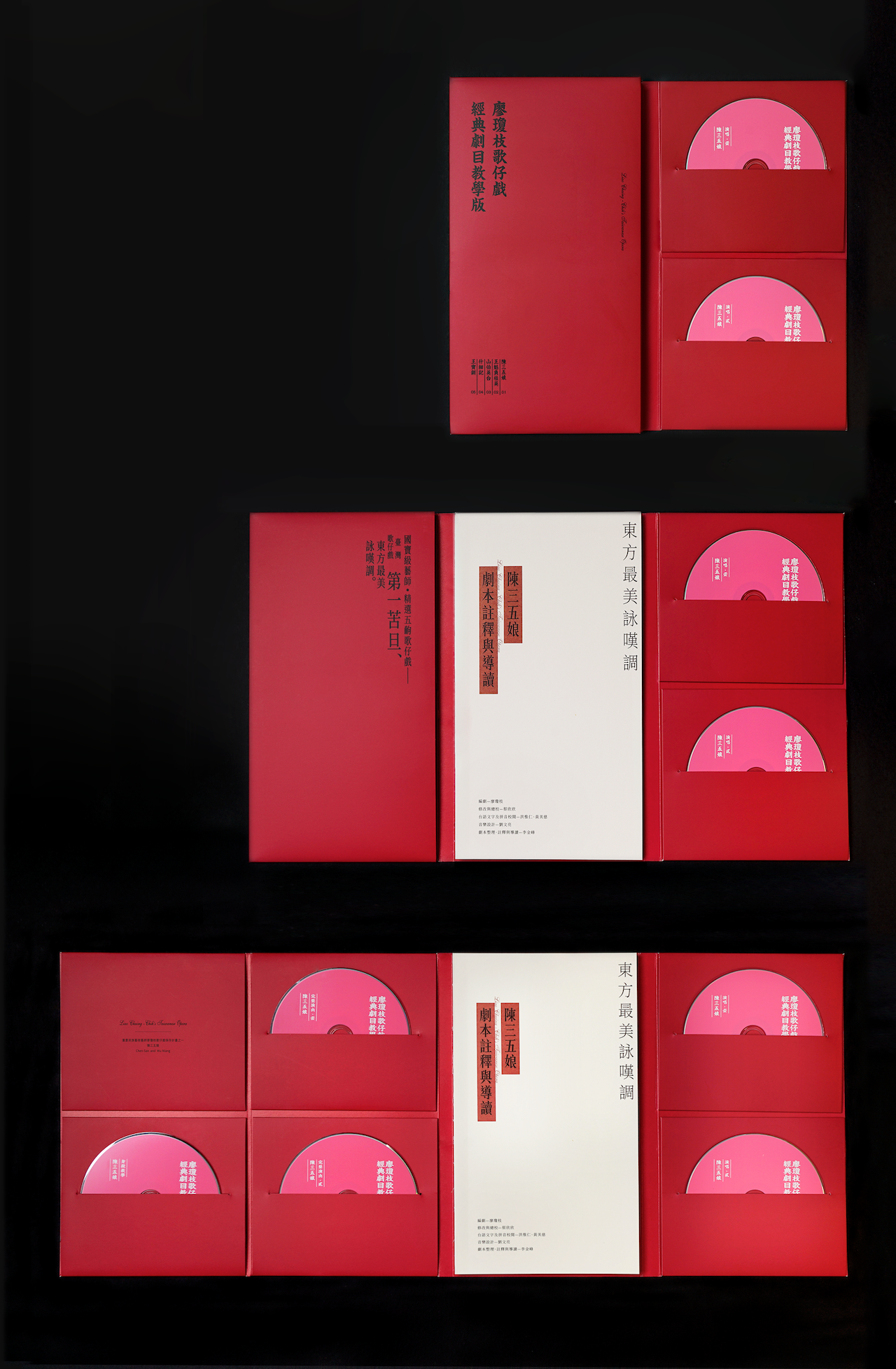
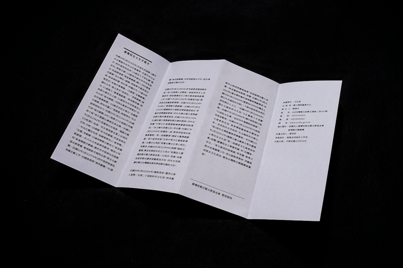
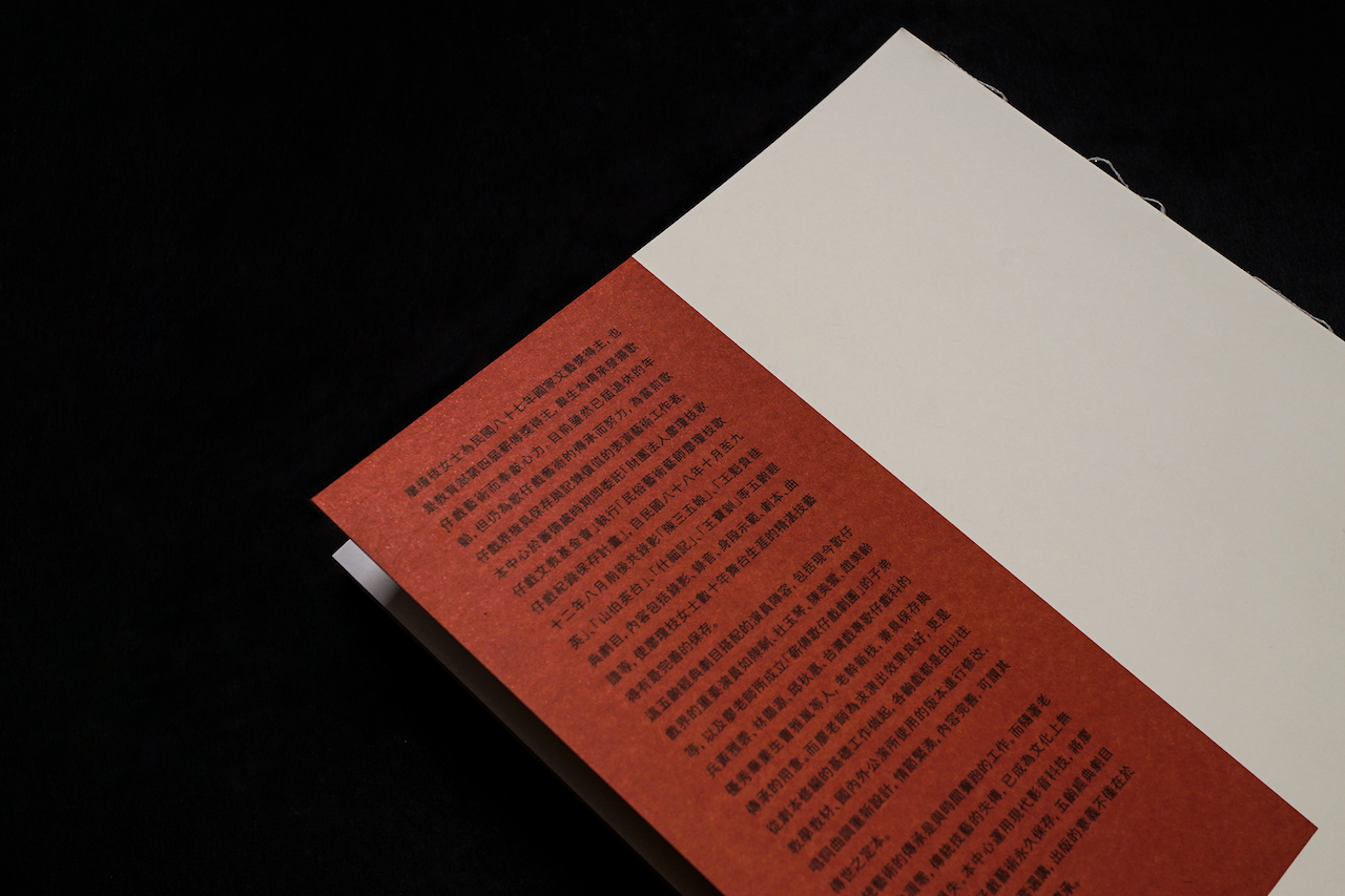
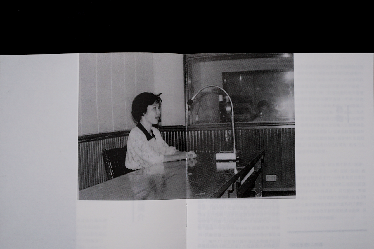
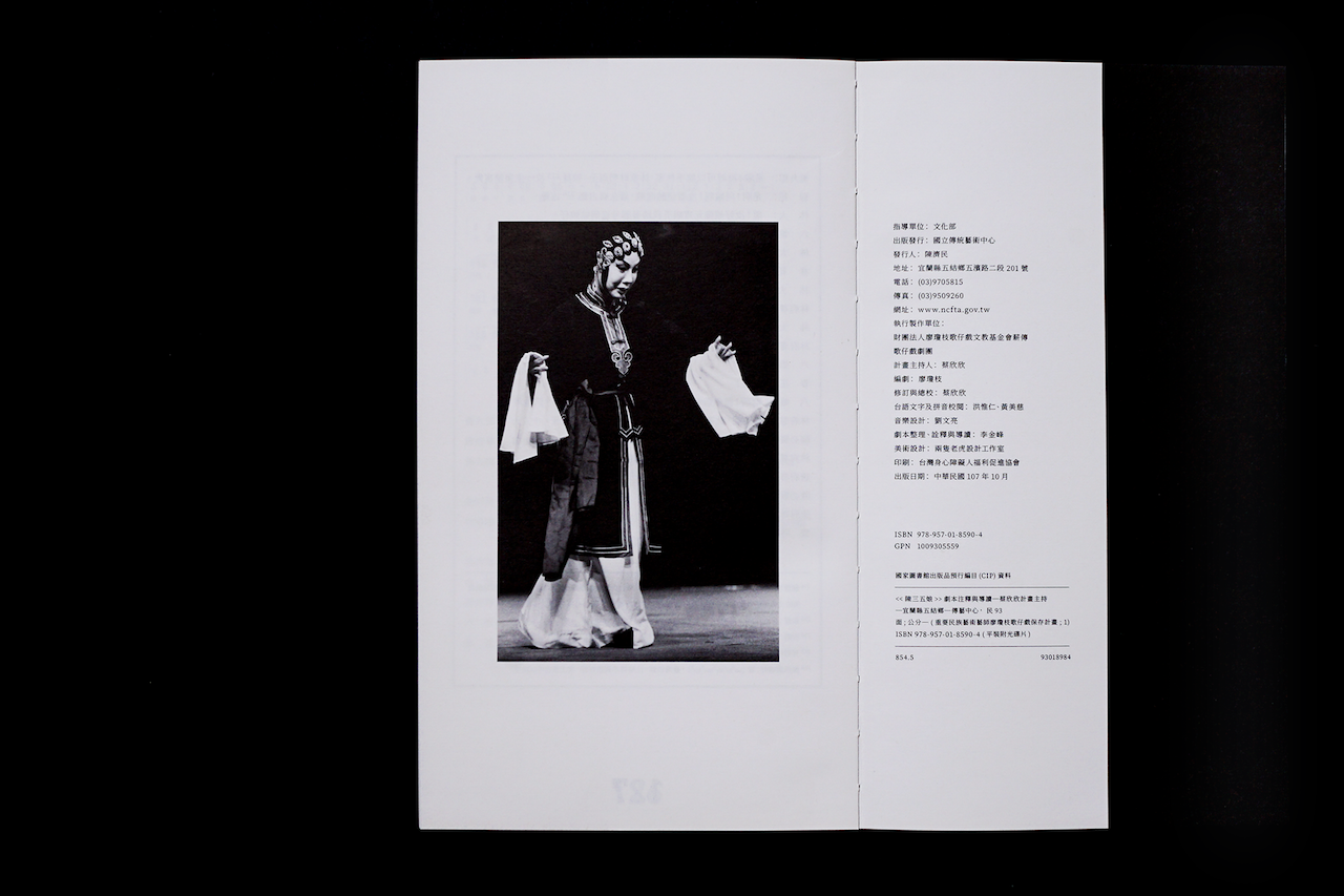
國寶級藝師廖瓊枝女士終其一生奉獻於歌仔戲薪傳,
獨特的哭腔與坎坷的人生經歷相互輝映,
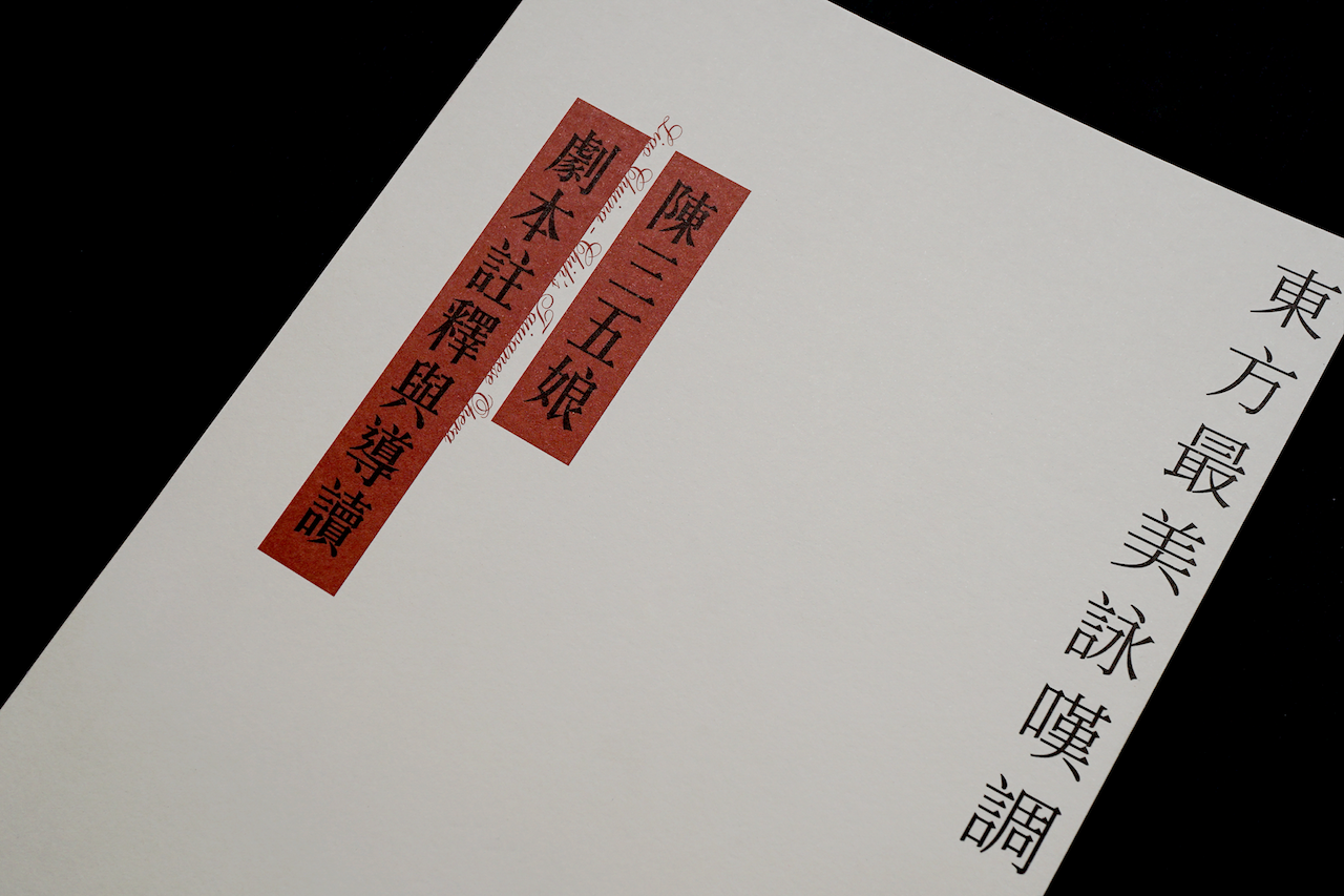
被譽為「東方最美的詠嘆調」、「台灣歌仔戲第一苦旦」。
台灣歌仔戲源於民間,是早年農業社會的精神娛樂,
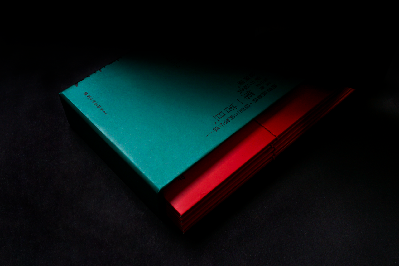
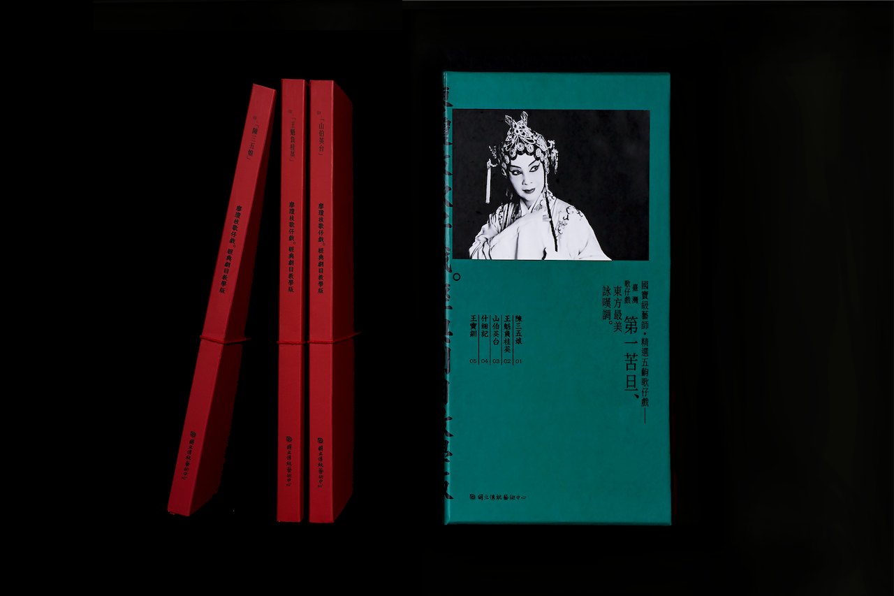
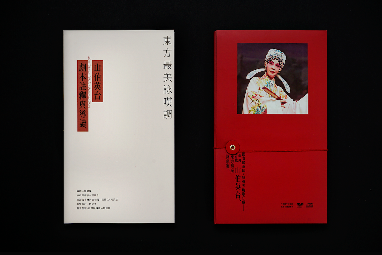
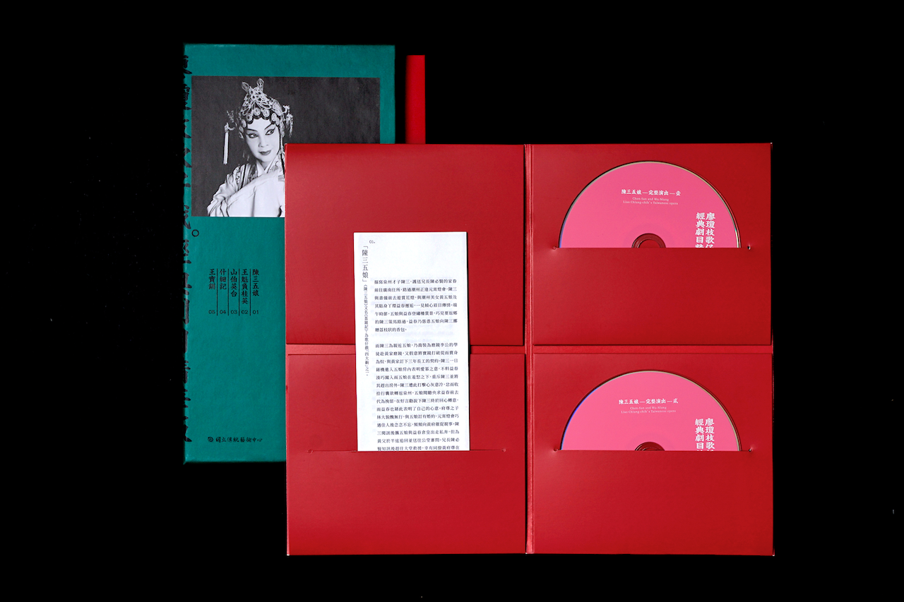
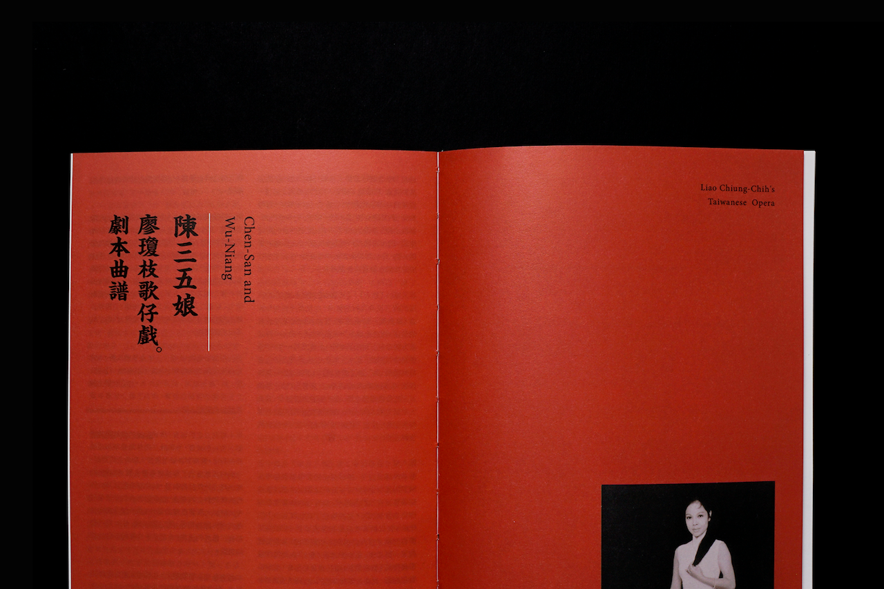
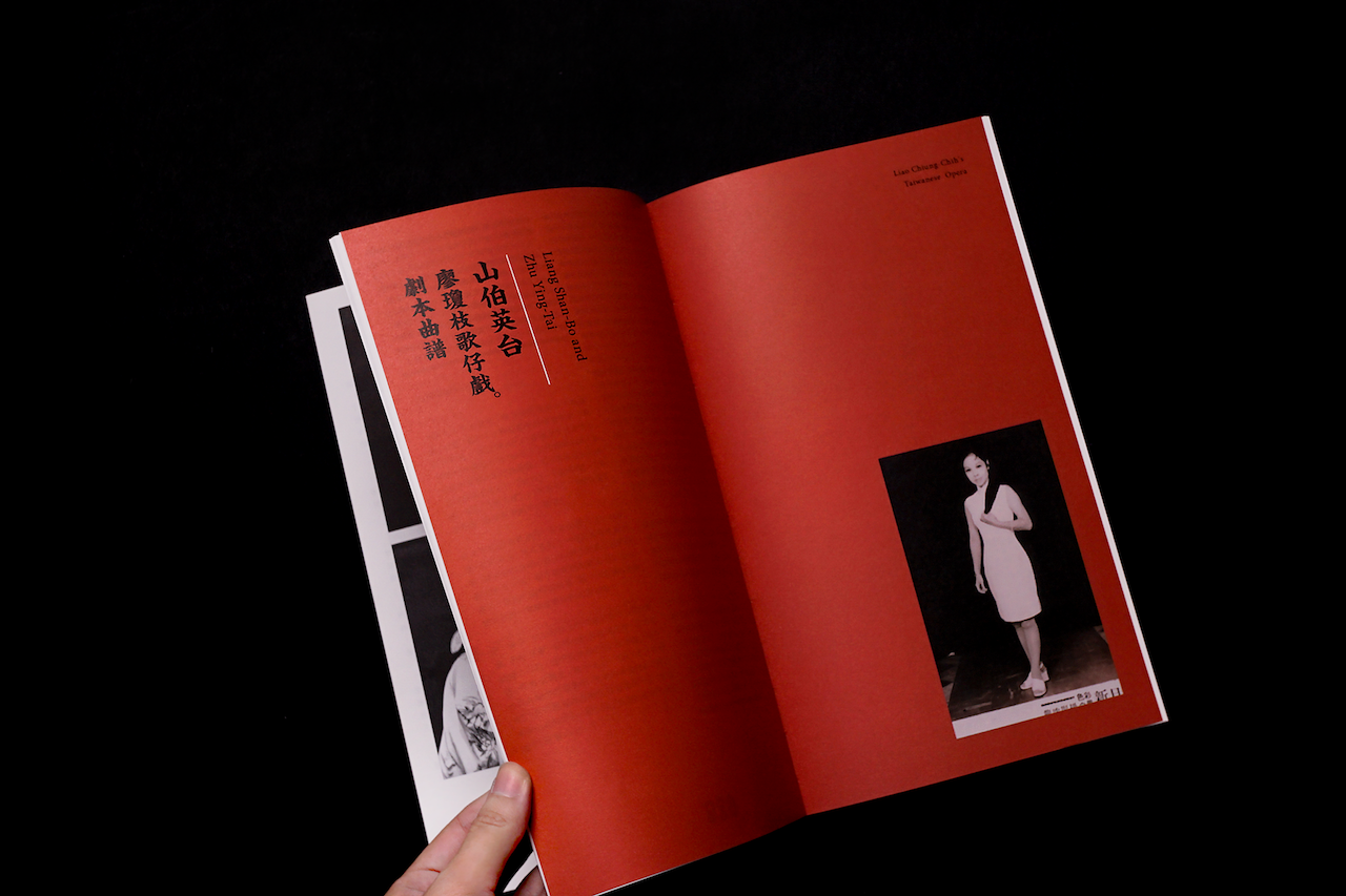
紅綠對比色彩來自戲棚與戲服鮮豔傳統的形象。
整體視覺有濃厚的草根感,但細節同時有細膩古典的氛圍,
代表歌仔戲的本土性和優美,也是廖女士歷經艱辛而堅毅溫謙的人格。
新穎傳統並濟的設計象徵歌仔戲文化隨時代更迭依舊經典,不斷流傳。
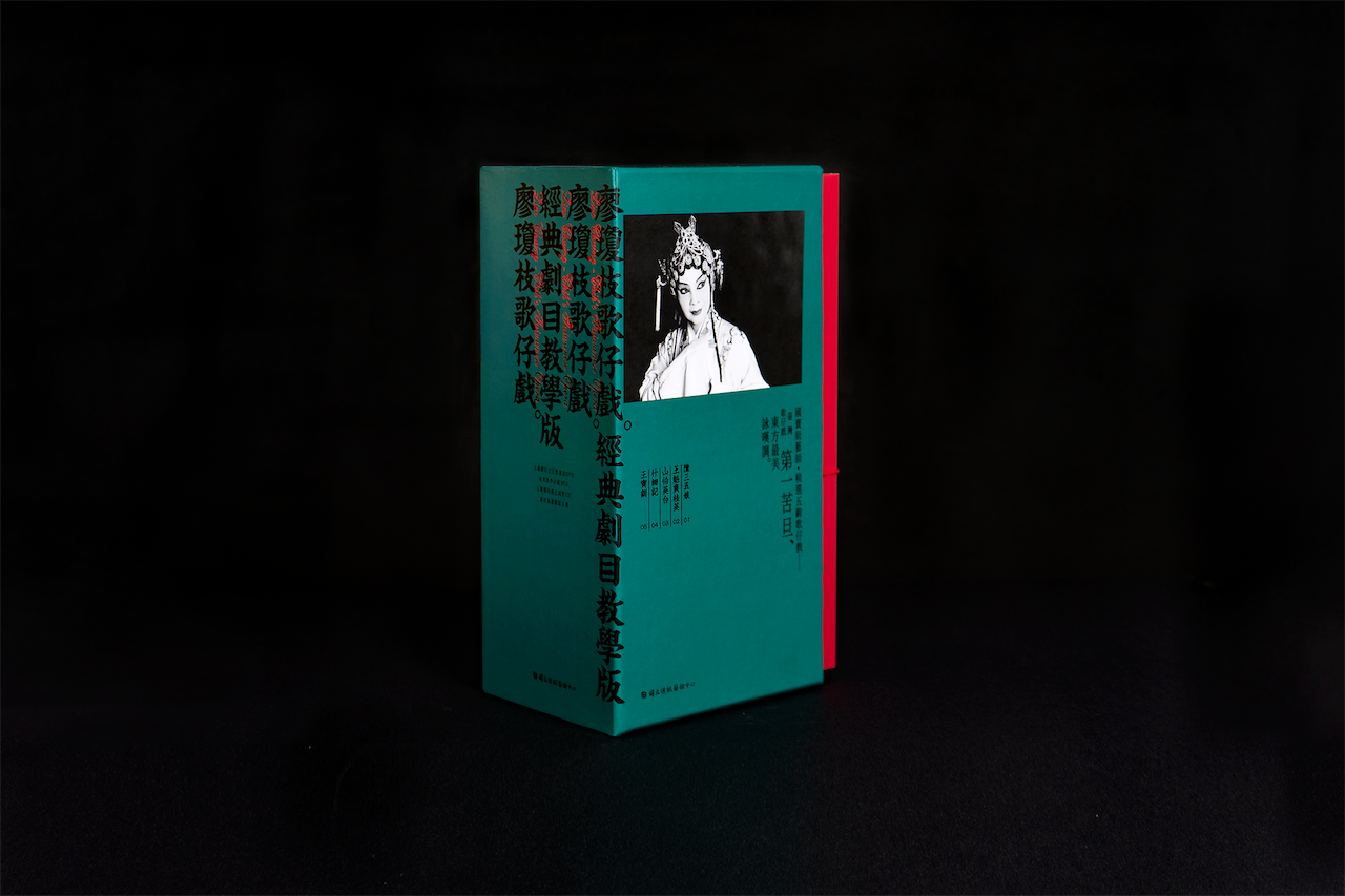
此次重新設計的目的除了視覺翻新以外還有包裝簡化,
包裝結構盡可能俐落,不做多餘的裝飾。
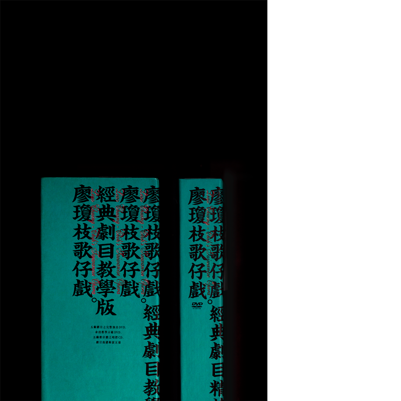
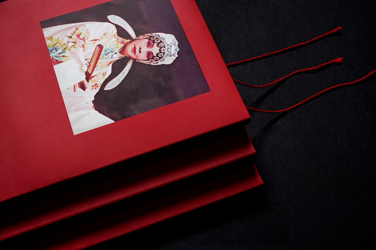
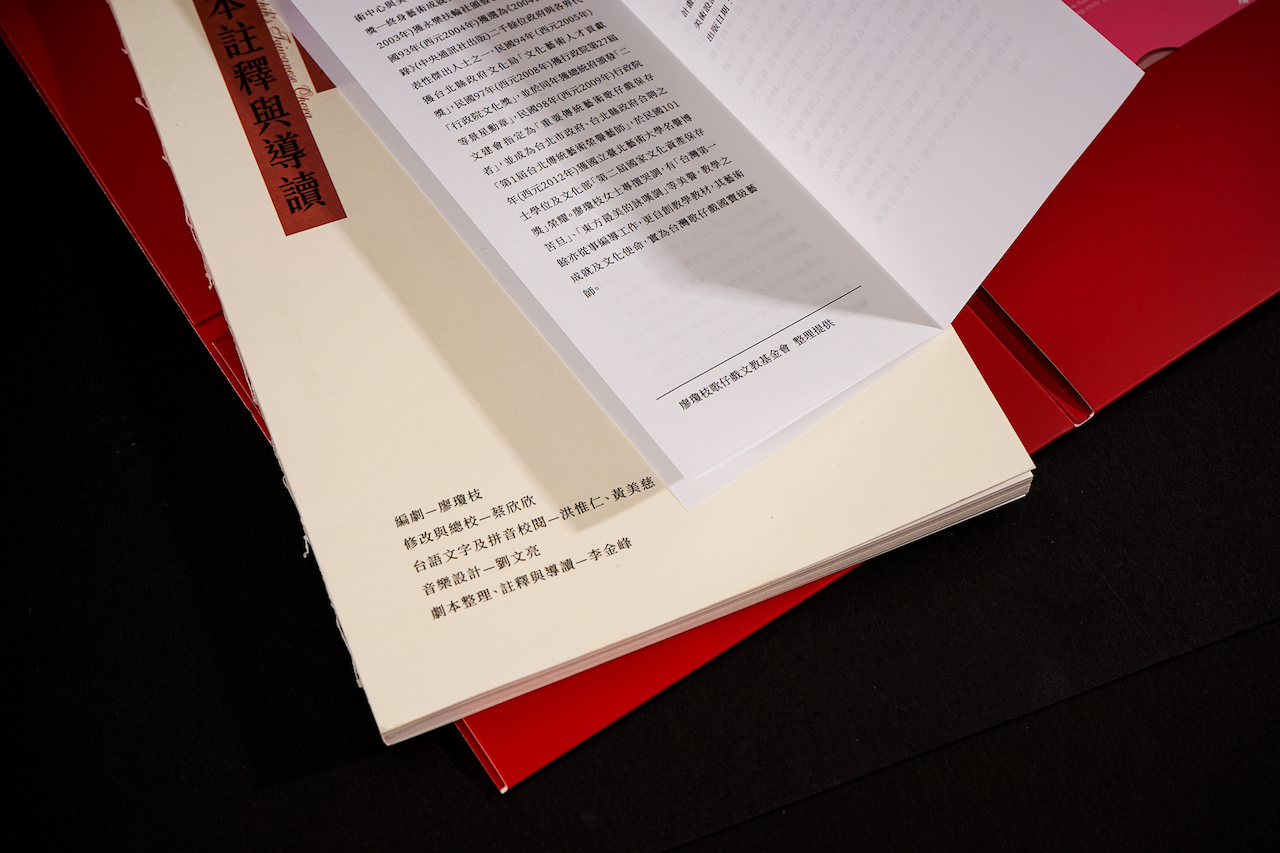
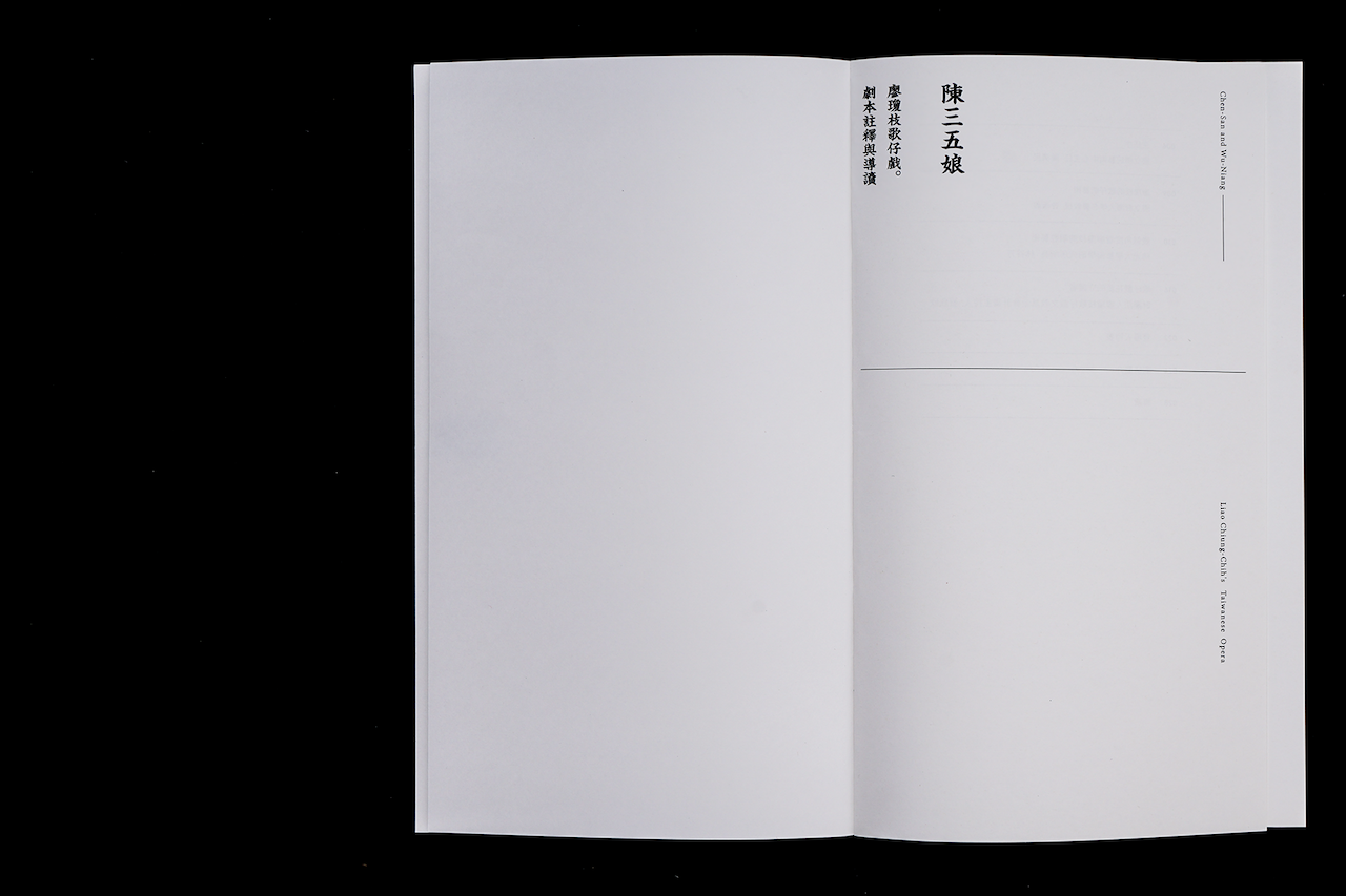
教學版單劇目的紅線圈和劇本的裸背線裝像是古書的裝幀方式,
劇本書背直接露出膠線,原始又典雅,
且可完全攤平,讓翻閱時更順暢。
A nationally revered artist, Liao Chiung-chih devoted most of her life to promoting the art of Taiwanese Opera.
Her unique crying technique in the performance seemed to reflect her tumultuous life.
Because of her signature crying style, she is deemed “the most beautiful crying voice in the East” and “the top tragedy performer in Taiwan”..Taiwanese Opera originated in the Han tradition.
It was the main form of entertainment in early Taiwanese agrarian society.
The high contrast and saturation between the red and green was inspired by the traditional set and costume used in performance.
Overall, the design has a very grassroots voice, but the details still retain a classical undertone.
The design accentuates the elegance in such a tradition.
The focus in the redesign is to minimize expendable elements in the packaging. The red string and exposed spine of the book took inspiration from traditional scripts.
Additionally, the exposed spine also allows for the the book to open all the way flat,
allowing the book to be read at maximum comfort.