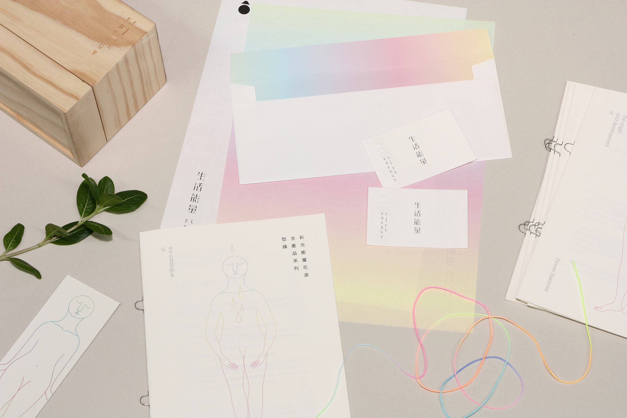
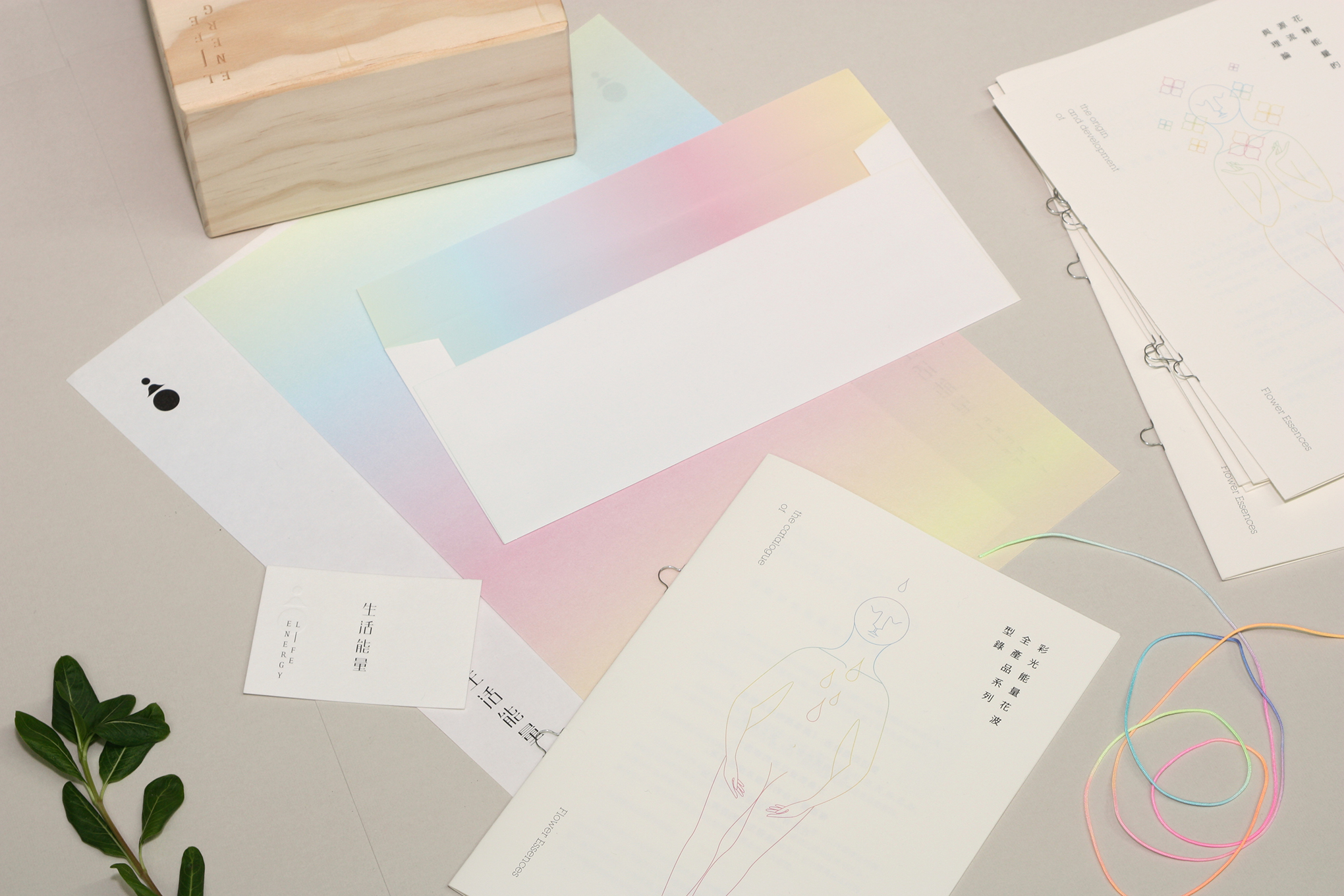
生活能量
Life Energy
branding, graphic deisgn, editionrial, web design
2014
Art Director
余岱官 Kuan
Designer
賴怡伶 (品牌視覺)
白偉奇+汪平 (網頁)
Photography
白偉奇
Life Energy
branding, graphic deisgn, editionrial, web design
2014
Art Director
余岱官 Kuan
Designer
賴怡伶 (品牌視覺)
白偉奇+汪平 (網頁)
Photography
白偉奇
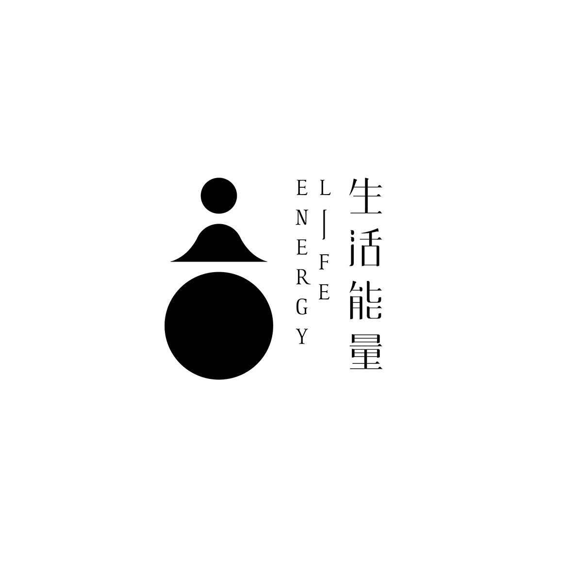
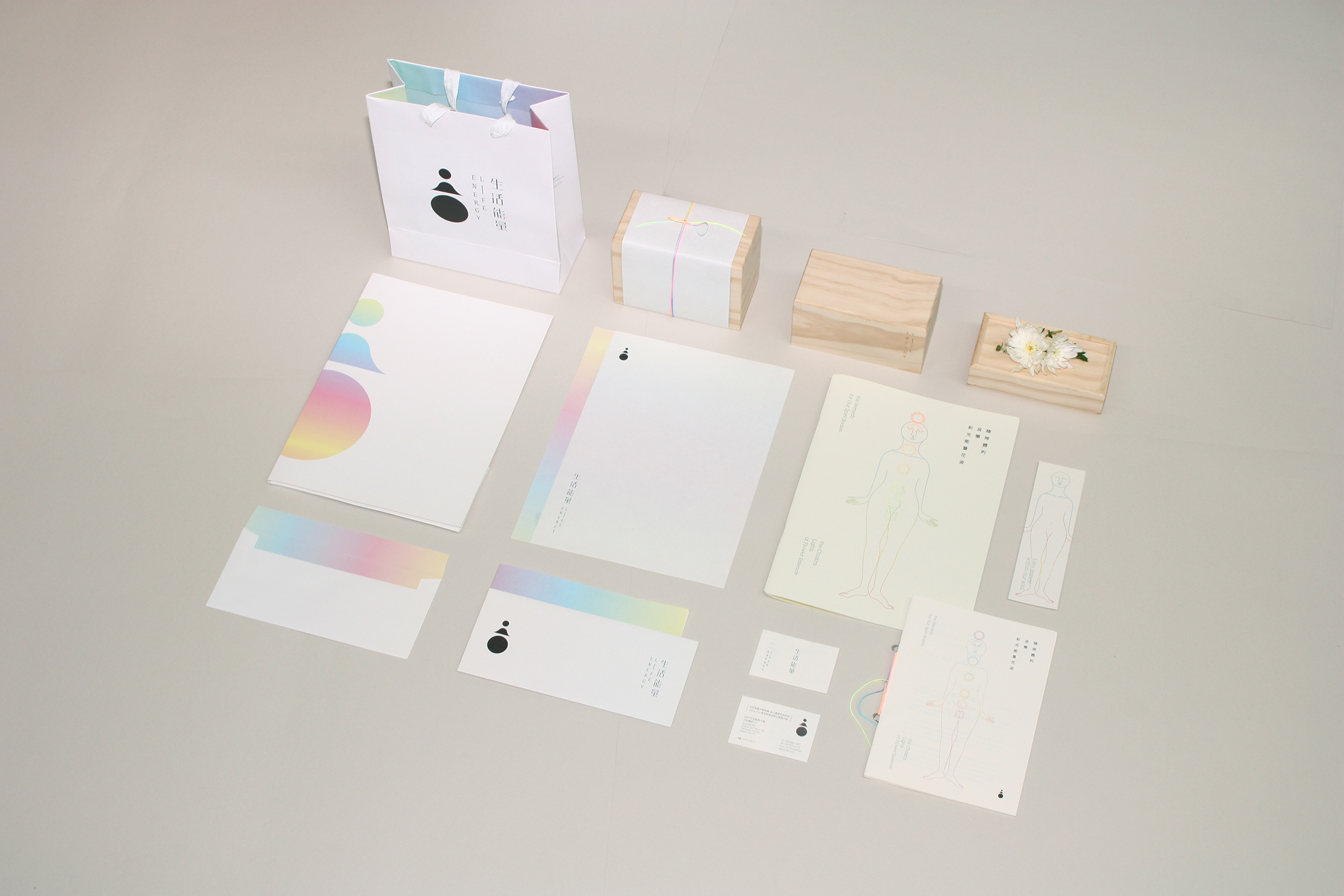
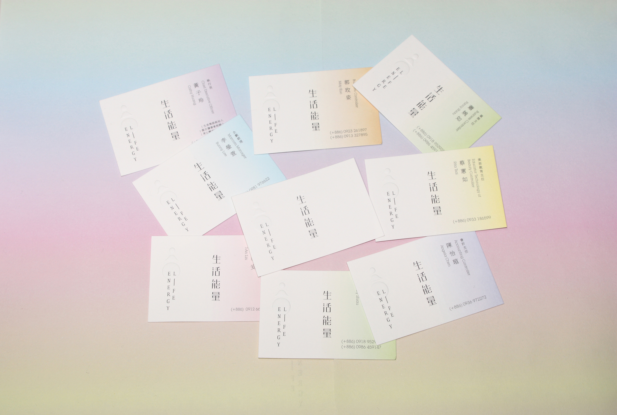
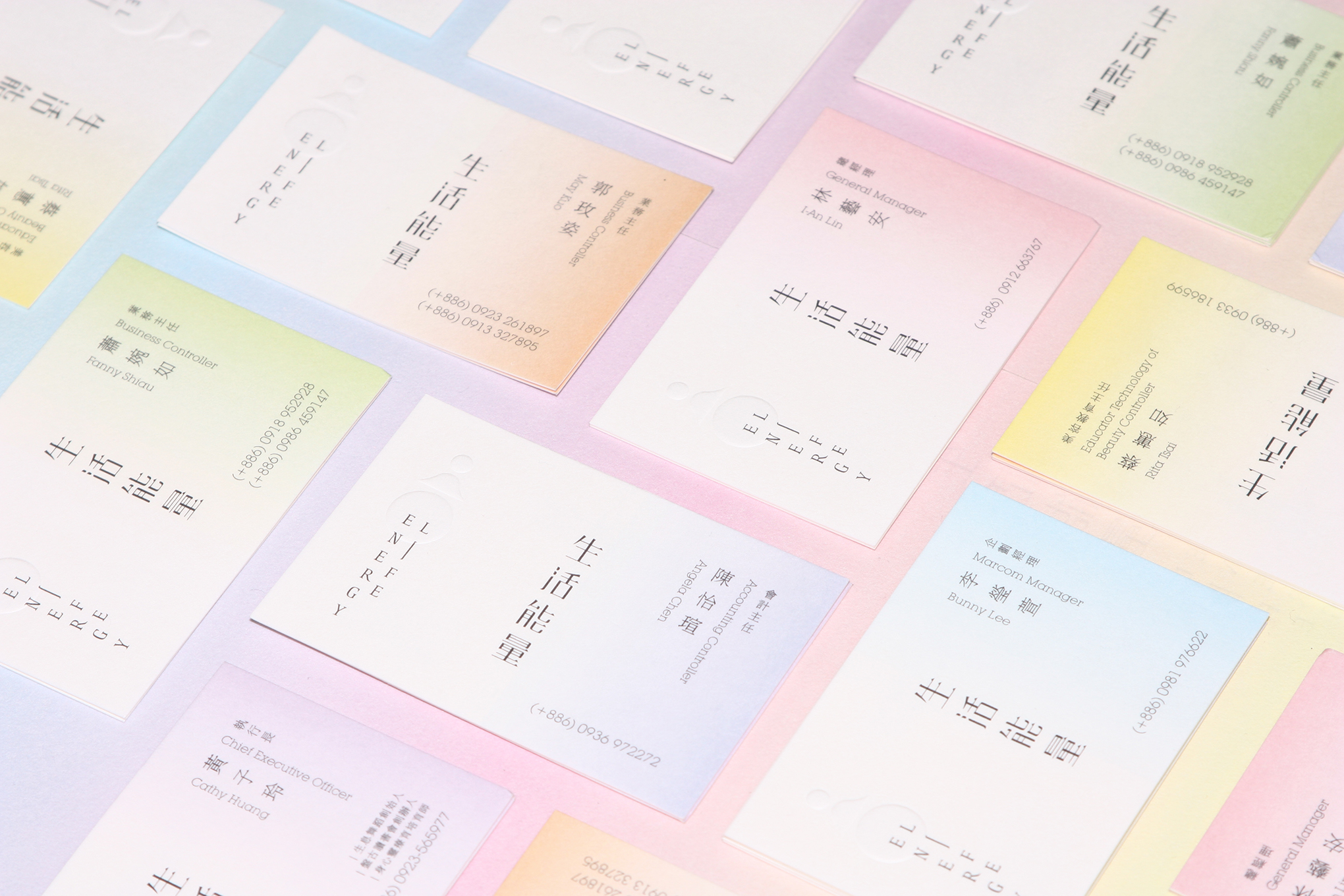
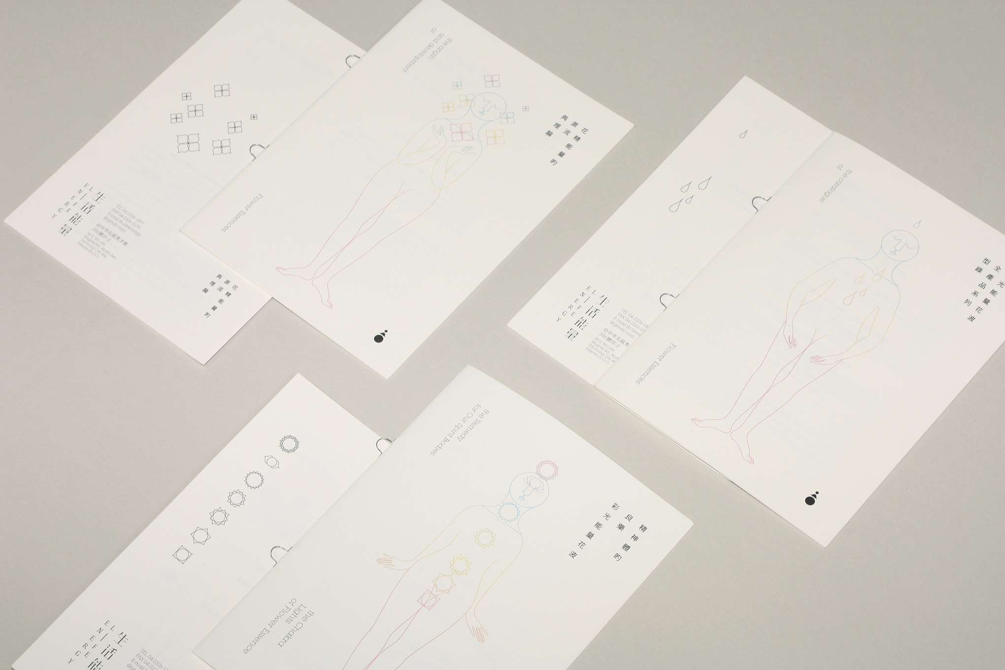
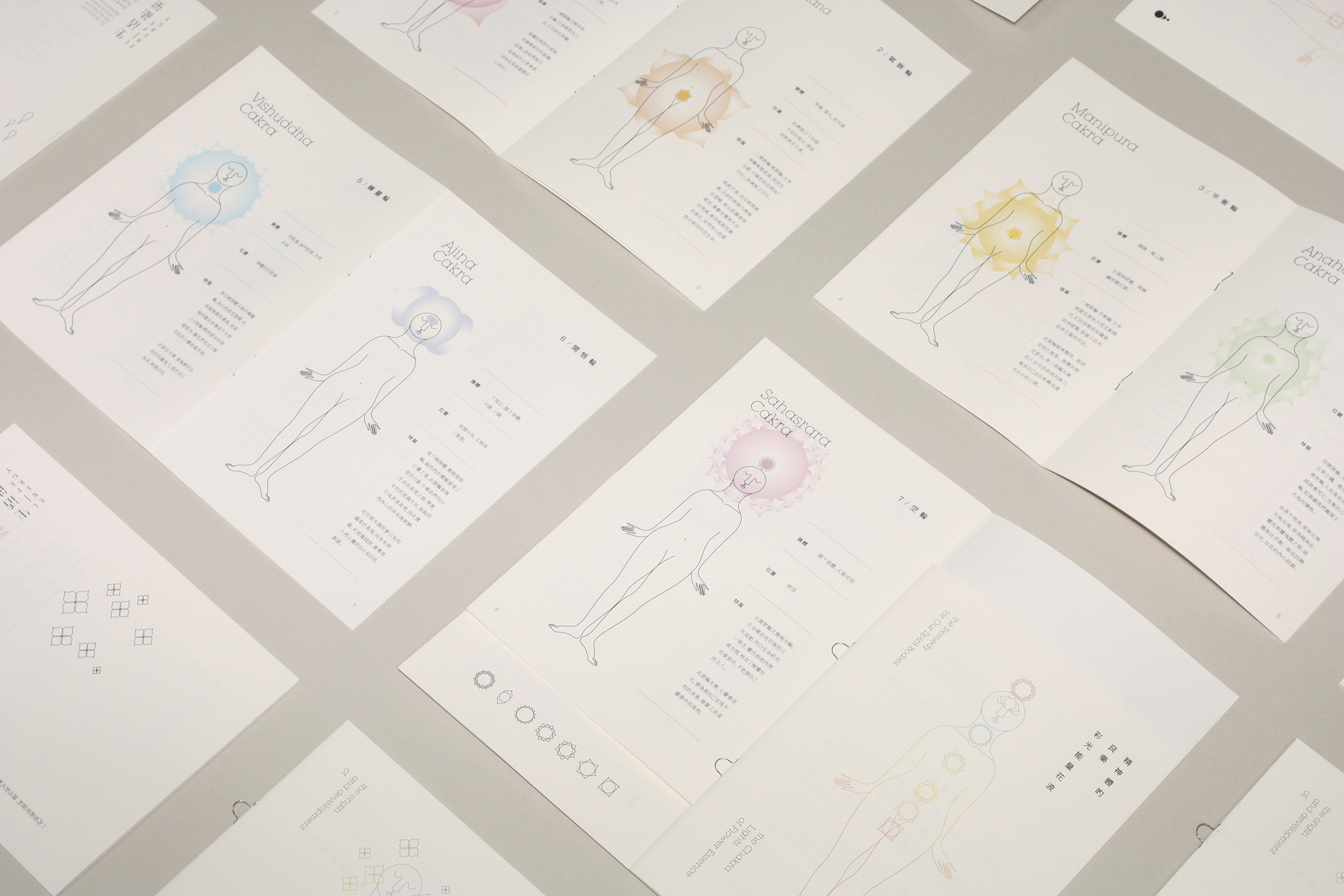
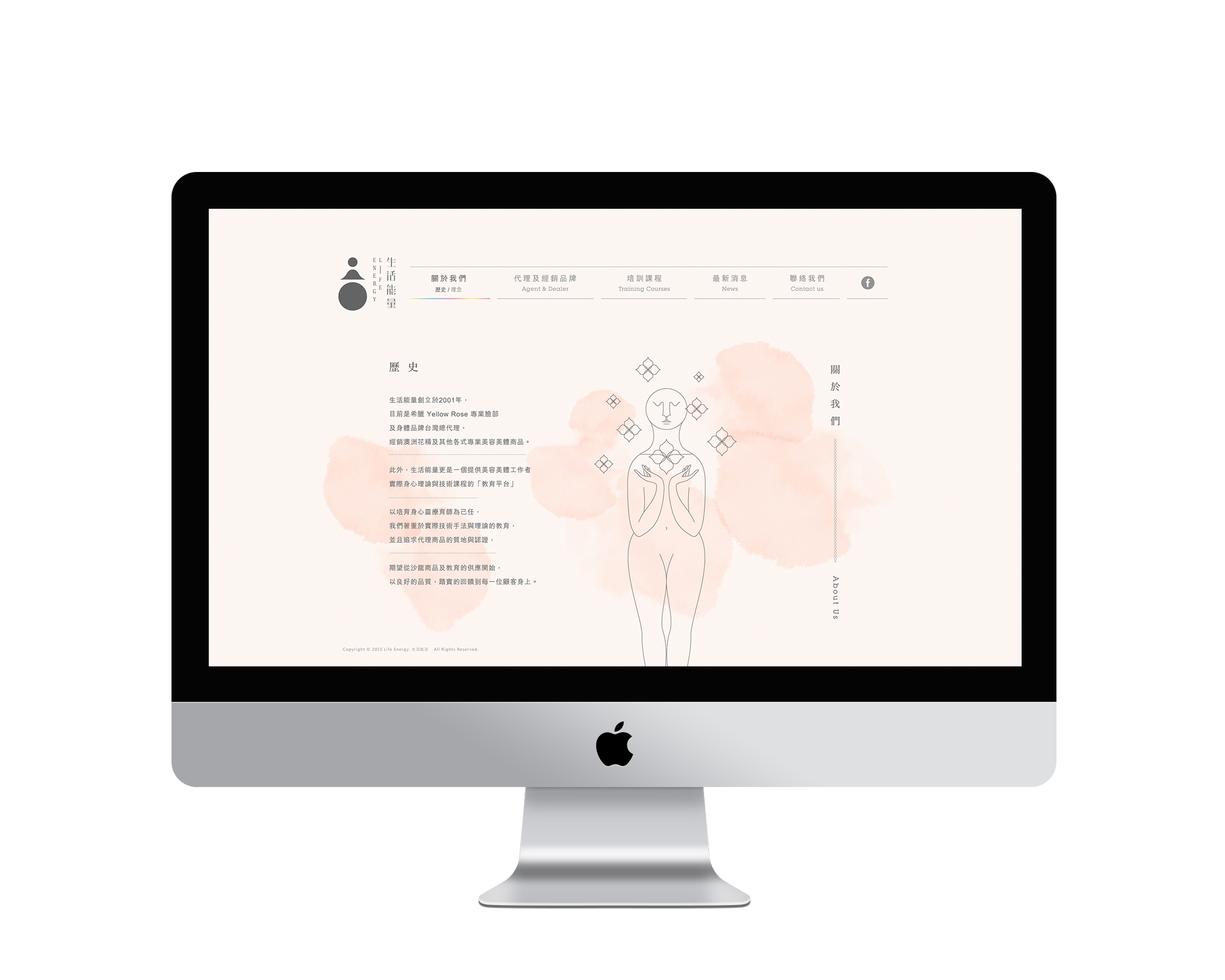
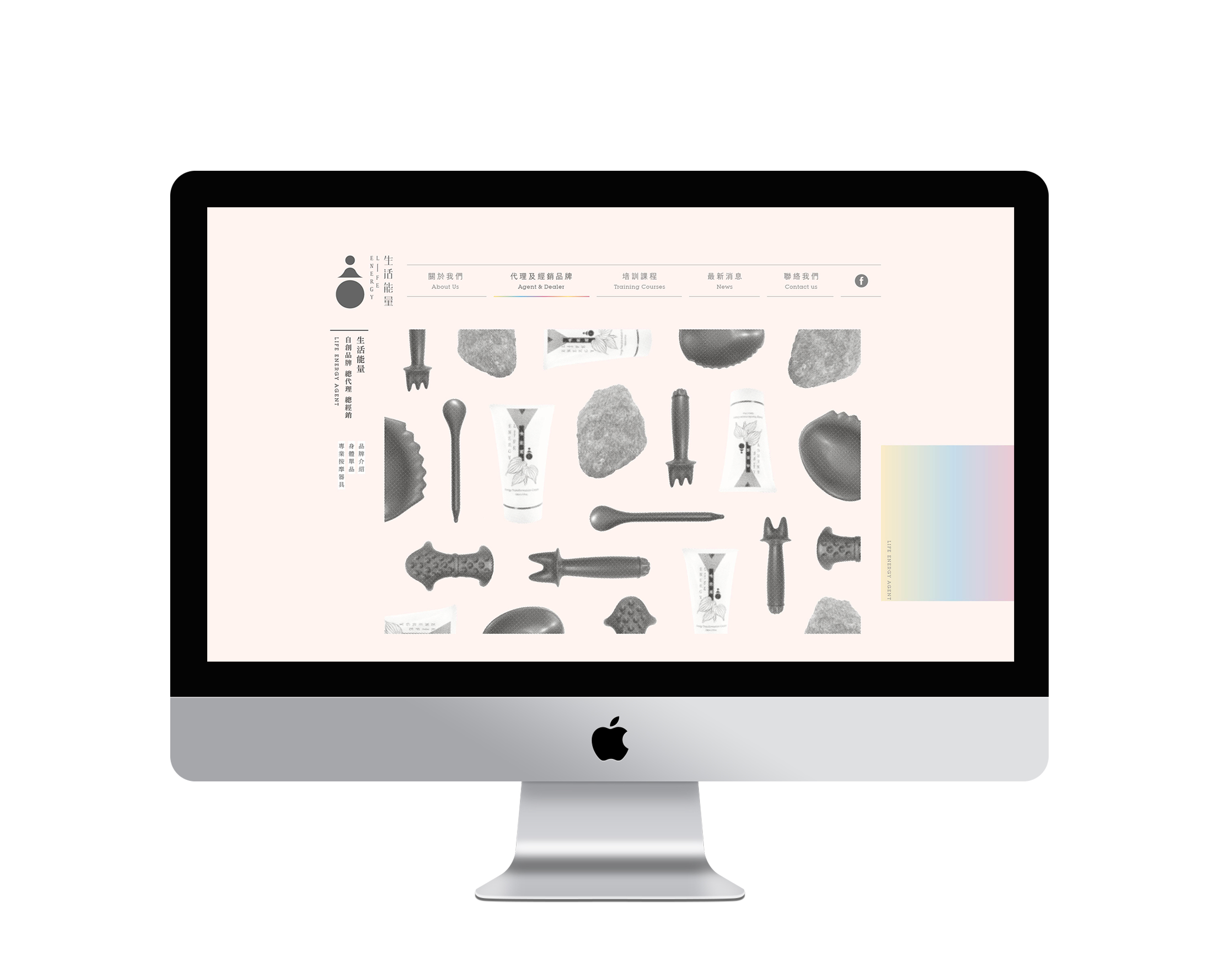
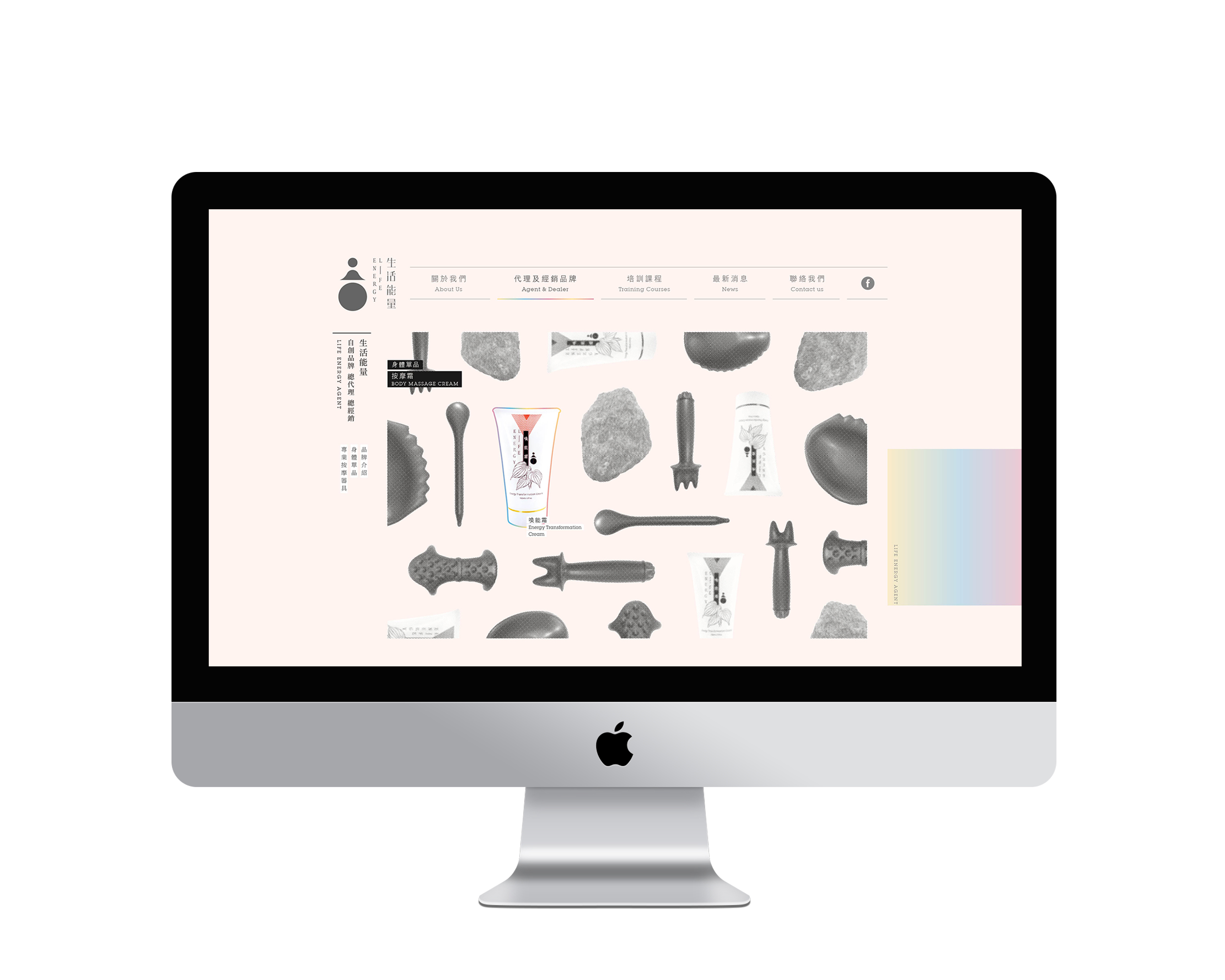
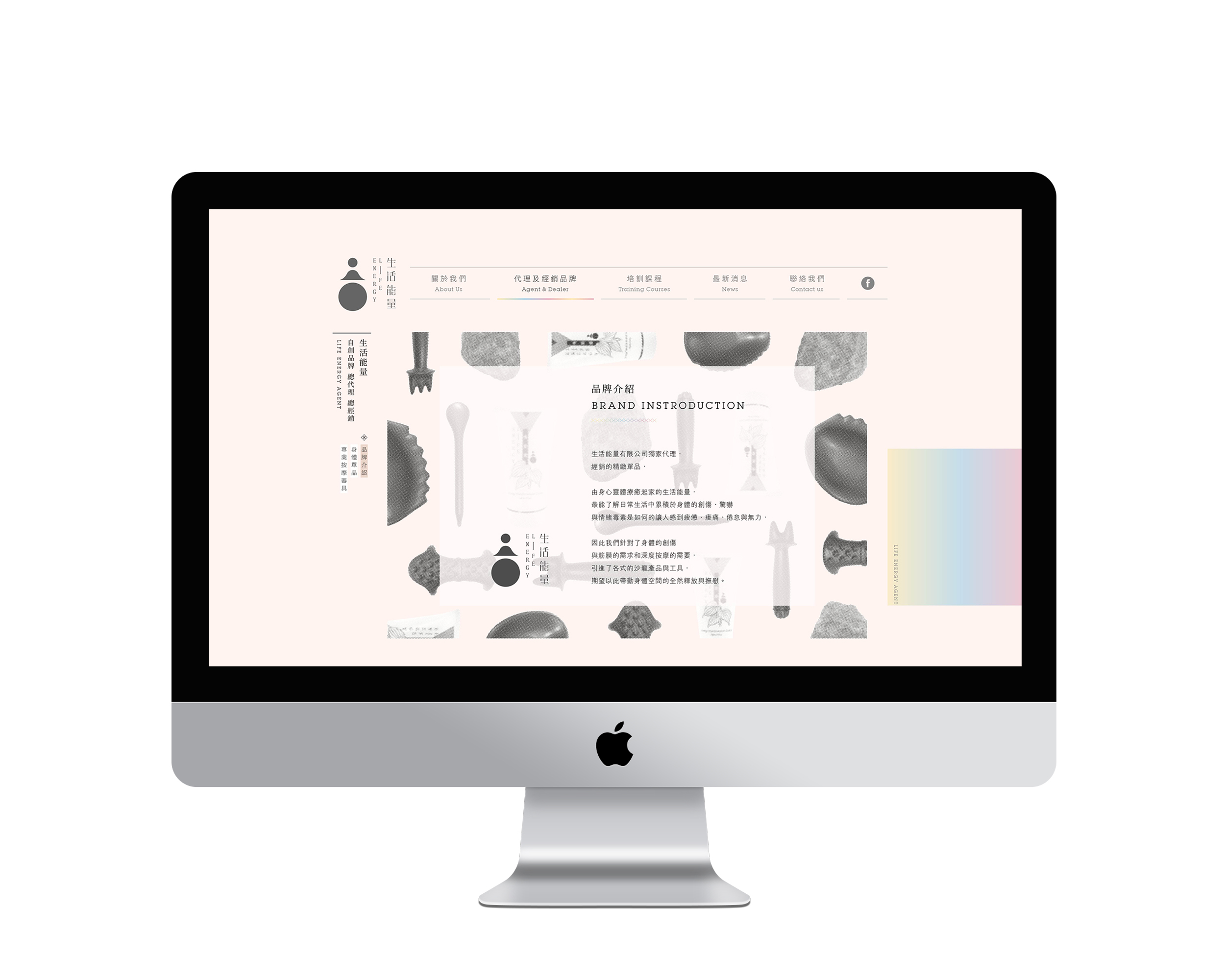
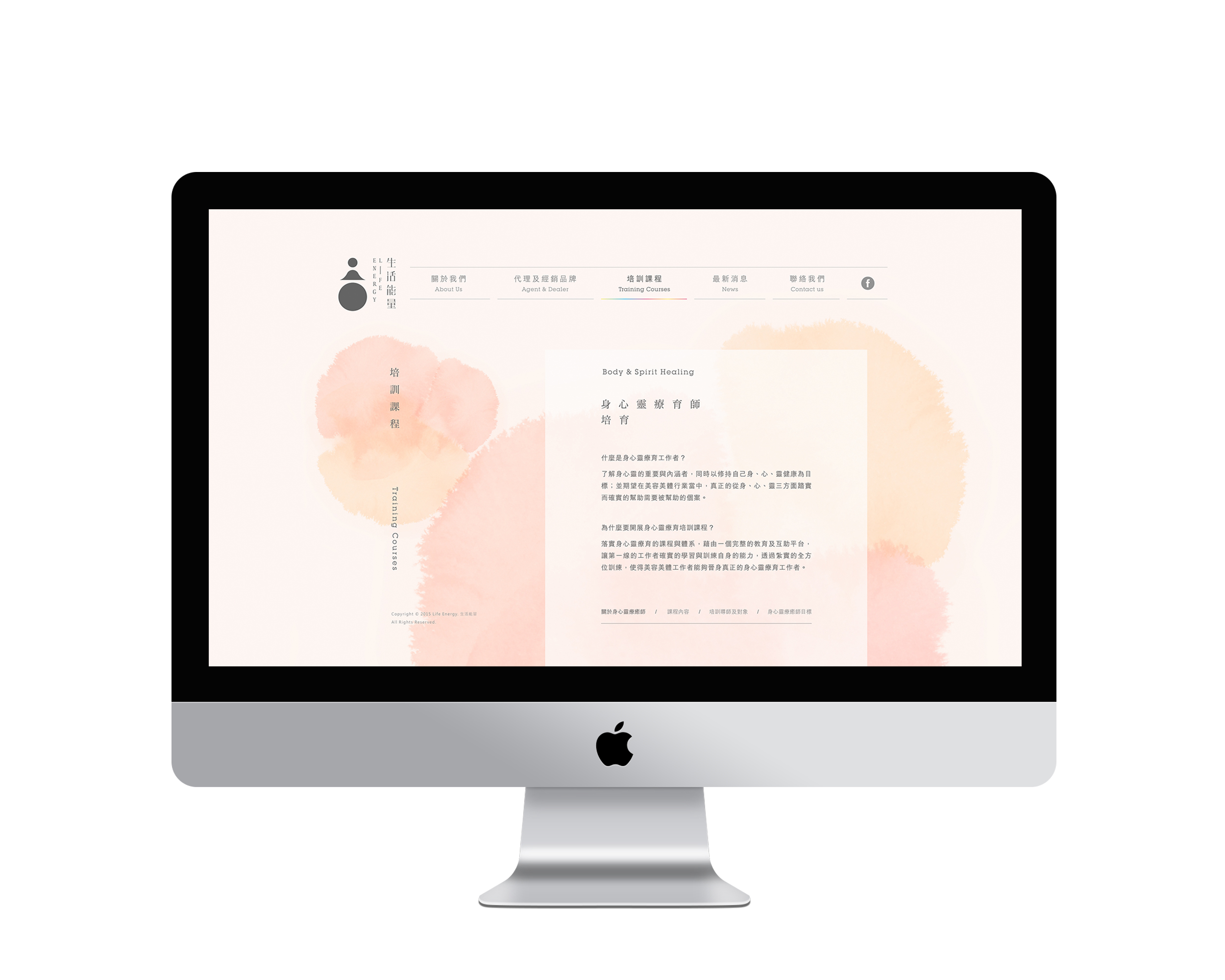
生活能量致力於推廣身心靈療育, 協助美容美體工作者,往真正的身心靈療育師領域前進。 期望藉由古人靜心之精神,與落實修行於生活, 使身心靈療育師的生活與心靈品質更加提升, 再以高品質的身心狀態回饋到每一位客戶身上。
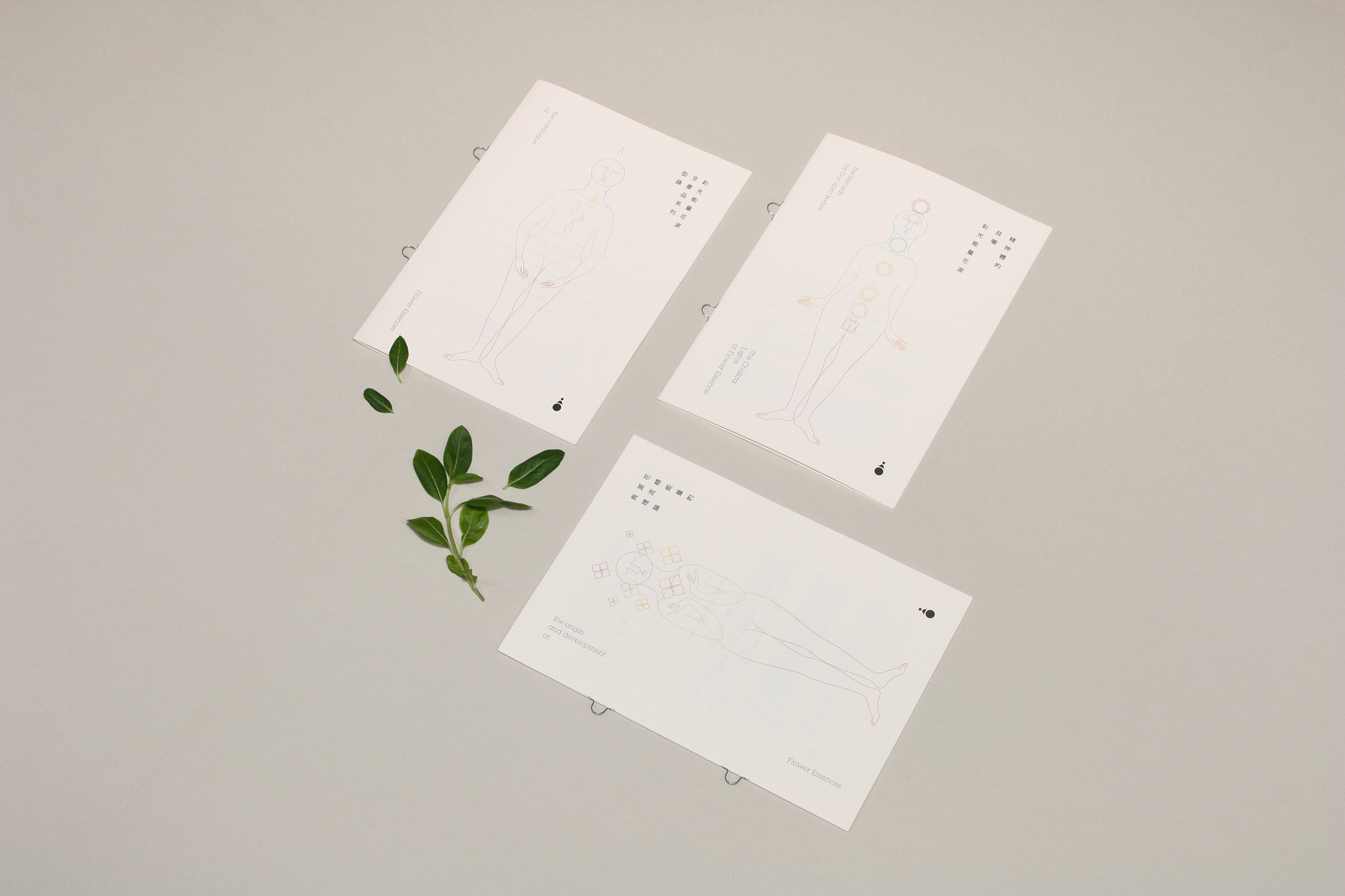
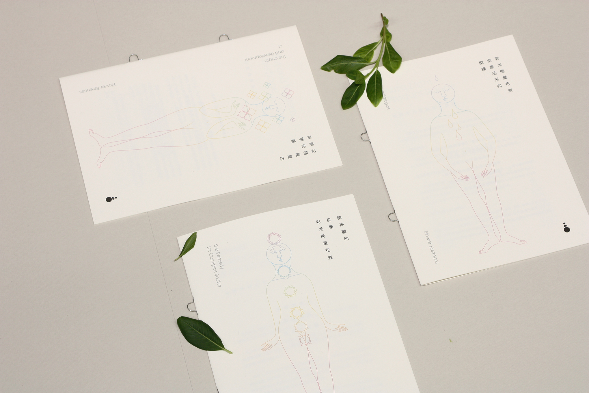
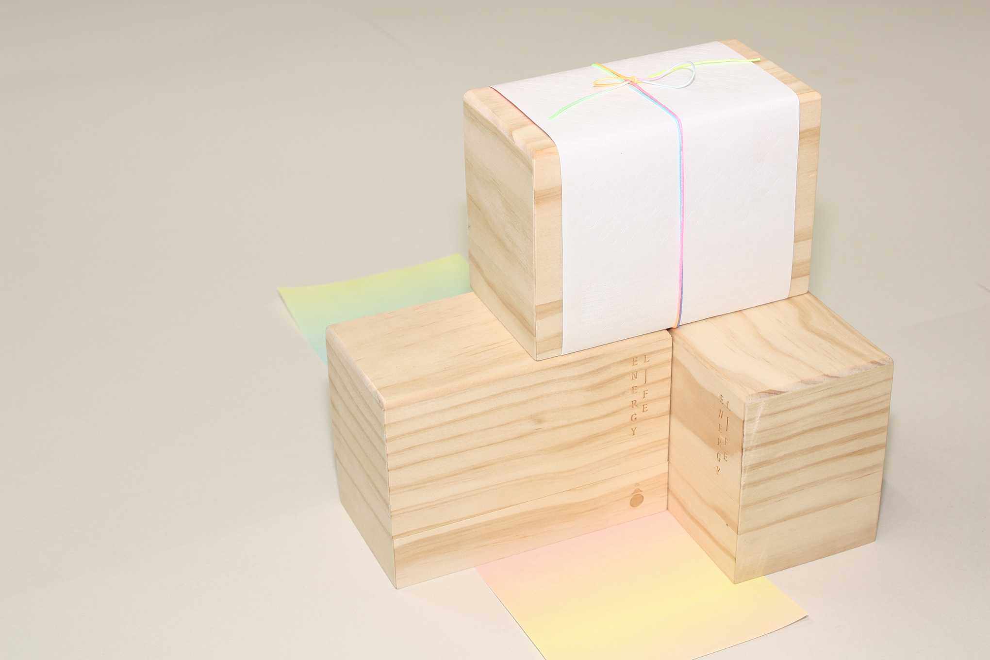
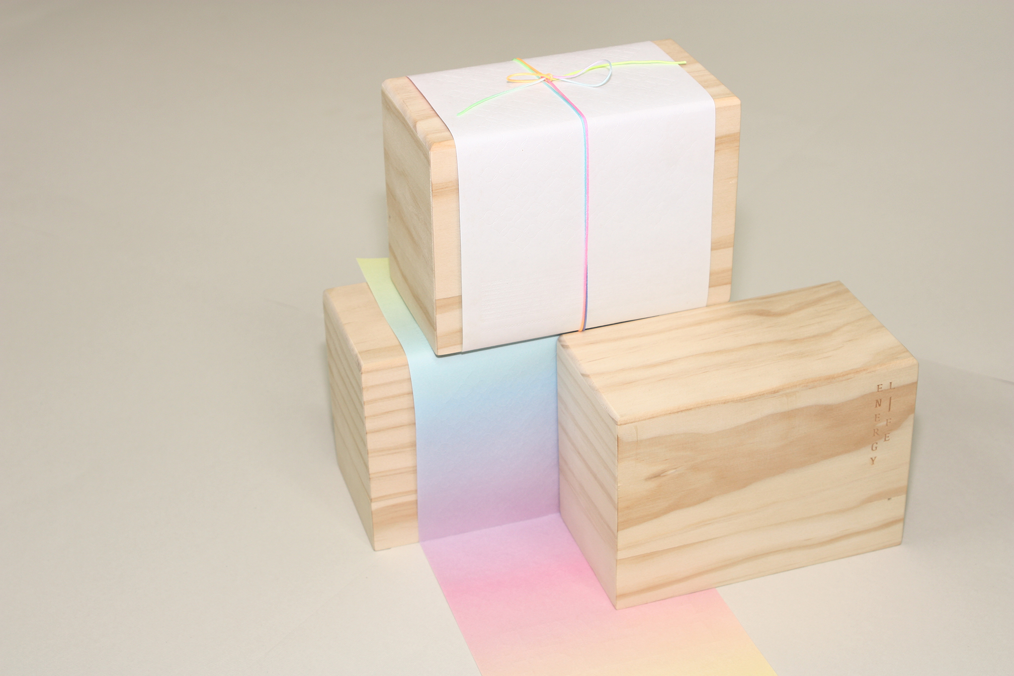
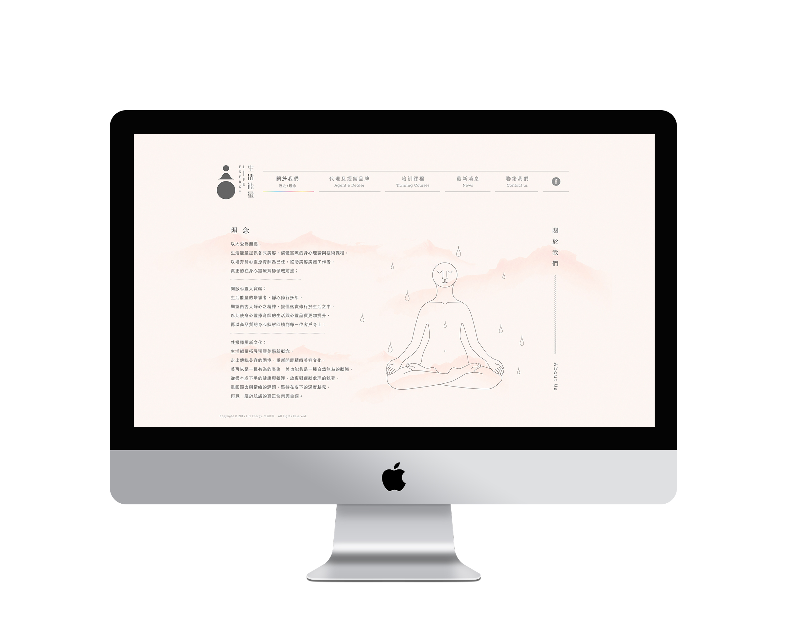
[身心清靜 默合自然]
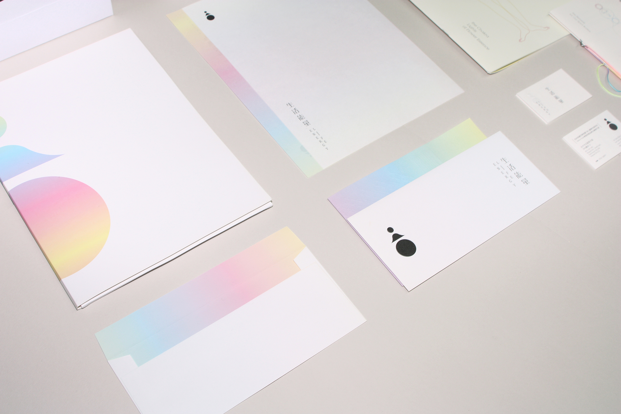
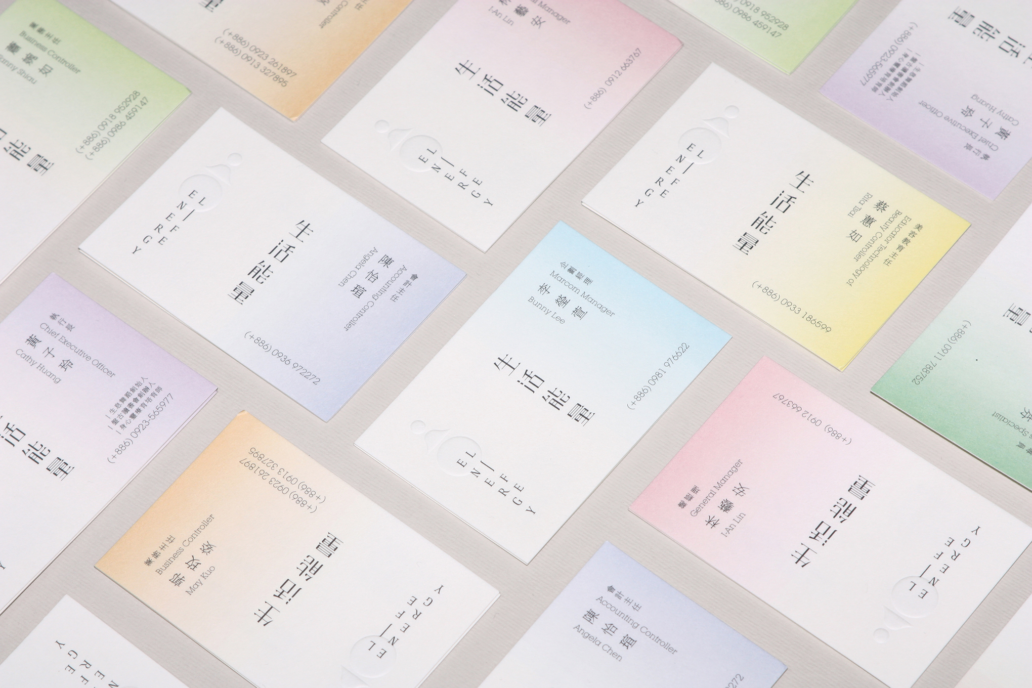
人是大自然的一部分; 回到大自然的懷抱,在靜裡孕育、療癒自我發生,啟動身智與心智。 寂靜是人類身心的最佳狀態,是生命最接近大自然的狀態; 天、地、人 與 靜 是logo設計主要概念,七彩是呼應人類精神體的七脈輪體。
Life Energy endeavors to promoting physical and spiritual healing, facilitating beauticians to become body, mind and spiritual therapists. It is hoped that the ancient spirit of peaceful mind will be applied to everyday life, thereby elevating the life and spiritual quality of body, mind and spiritual therapists, so that they can transfer a high quality physical and mental state to each client.
[Peaceful body and mind - In resonance with nature]
People are a part of nature; return to the embrace of Mother Nature, where healing and nurturing take place in silence, in turn inspiring physical and mental development. Silence is the ideal condition for the mind and the body, because it is when life is closest to Mother Nature; The logo design mainly draws inspiration from the heaven, earth, people and tranquility,rainbow colors correspond to the Seven Chakras or energy centers of the human body.
[身心清靜 默合自然]
人是大自然的一部分; 回到大自然的懷抱,在靜裡孕育、療癒自我發生,啟動身智與心智。 寂靜是人類身心的最佳狀態,是生命最接近大自然的狀態; 天、地、人 與 靜 是logo設計主要概念,七彩是呼應人類精神體的七脈輪體。
Life Energy endeavors to promoting physical and spiritual healing, facilitating beauticians to become body, mind and spiritual therapists. It is hoped that the ancient spirit of peaceful mind will be applied to everyday life, thereby elevating the life and spiritual quality of body, mind and spiritual therapists, so that they can transfer a high quality physical and mental state to each client.
[Peaceful body and mind - In resonance with nature]
People are a part of nature; return to the embrace of Mother Nature, where healing and nurturing take place in silence, in turn inspiring physical and mental development. Silence is the ideal condition for the mind and the body, because it is when life is closest to Mother Nature; The logo design mainly draws inspiration from the heaven, earth, people and tranquility,rainbow colors correspond to the Seven Chakras or energy centers of the human body.