由父親經營的水電行起家,目前由第二代經營,
以保護台灣工廠與精進為企業初衷。
整合台灣相關商品與部分日本商品,立基台灣,銷售至東南亞或其他市場。
設計以代表產業調性的藍搭配漸層與附屬圖來表達廣闊、四通八達、往來交換的品牌精神。
| 品牌標誌 | 融合品牌英文名P.S.Q. ; 獨特且有東方氣質的嚴謹感。
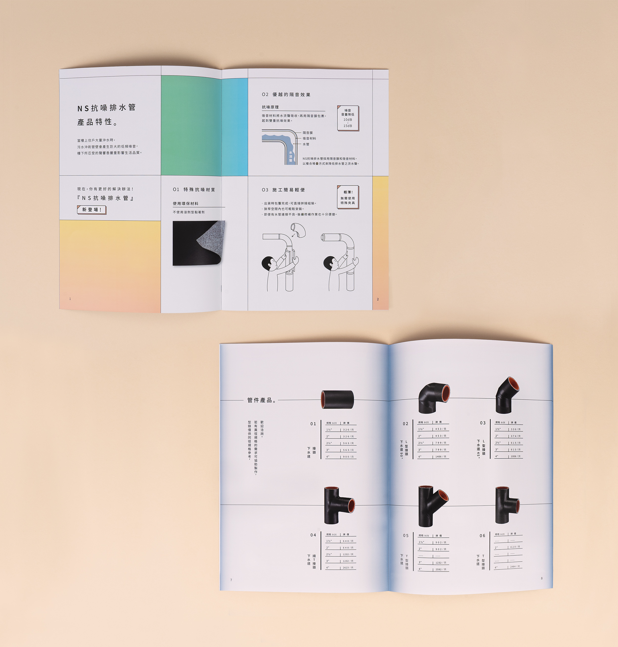
| 型錄設計 | 此型錄不會廣泛流通於一般消費者, 為B2B用途, 以雙封面來吸引眼球目光, 與市場上產品照即是封面的型錄有所區隔, 內容沿續VI漸層應用與簡單易懂線條插畫方式呈現。
以保護台灣工廠與精進為企業初衷。
整合台灣相關商品與部分日本商品,立基台灣,銷售至東南亞或其他市場。
設計以代表產業調性的藍搭配漸層與附屬圖來表達廣闊、四通八達、往來交換的品牌精神。
| 品牌標誌 | 融合品牌英文名P.S.Q. ; 獨特且有東方氣質的嚴謹感。
| 型錄設計 | 此型錄不會廣泛流通於一般消費者, 為B2B用途, 以雙封面來吸引眼球目光, 與市場上產品照即是封面的型錄有所區隔, 內容沿續VI漸層應用與簡單易懂線條插畫方式呈現。
Founded initially as an electrical & plumbing service by the owner’s father, PSQ was later passed on to the second generation, maintaining the father’s ethos of preserving Taiwanese factories and innovating them. Integrating Taiwanese products with Japanese products, PSQ sets out in Taiwan to promote sales in southeast Asian markets and beyond.
The main design takes on a blue gradient to emphasize the ever-expanding business, conveying a sense of borderless business trade. Logo - Incorporating the acronym PSQ and giving it a unique but straightforward characteristicDM design - This DM is geared towards B2B purpose. With a double cover design, the dm sets itself apart from generic catalogs. The gradient element is applied throughout the dm in conjunction with easily understood line illustrations.
The main design takes on a blue gradient to emphasize the ever-expanding business, conveying a sense of borderless business trade. Logo - Incorporating the acronym PSQ and giving it a unique but straightforward characteristicDM design - This DM is geared towards B2B purpose. With a double cover design, the dm sets itself apart from generic catalogs. The gradient element is applied throughout the dm in conjunction with easily understood line illustrations.


