巴蕾麵包
Palais Boulangerie
branding, package design, souvenir
2012
Art Director
余岱官 Kuan
Designer
賴怡伶
Photography
賴怡伶
Palais Boulangerie
branding, package design, souvenir
2012
Art Director
余岱官 Kuan
Designer
賴怡伶
Photography
賴怡伶
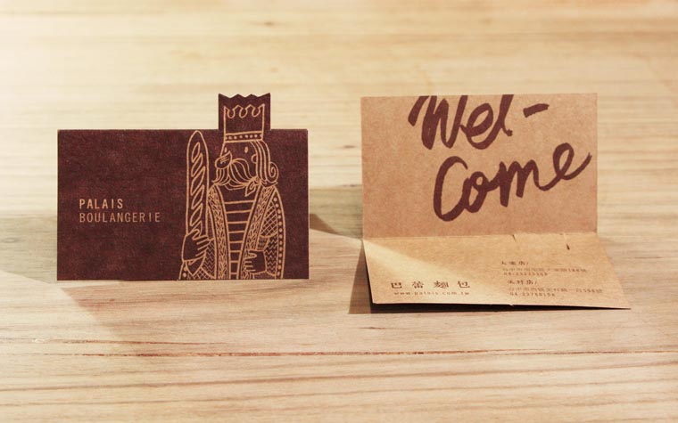
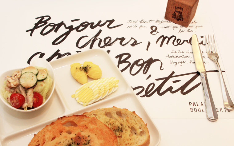
巴蕾二店開幕,有別於第一家店豐富的品項內容,二店精簡品項,更專注於正統的歐式麵包,並且新增了咖啡與輕食的營業項目,複合式空間多了讓客人坐下來享受現做餐點的選擇。企業識別也配合現有的形象全面翻新,logo以簡約中性的英文字體傳達出現代感與專業形象,搭配粗獷手寫英文與插圖,融入咖啡與輕食隨性自在的生活態度。
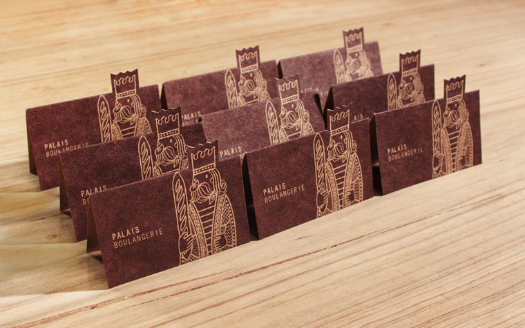
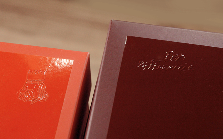
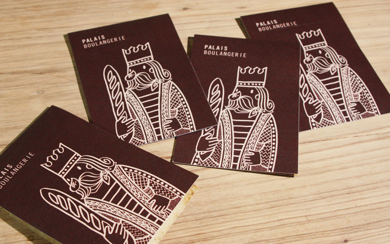
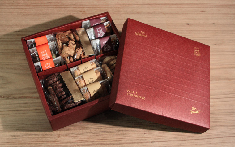
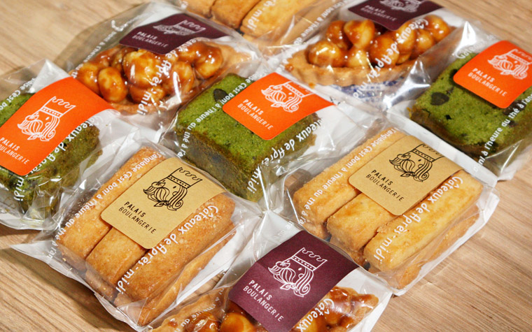
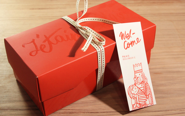
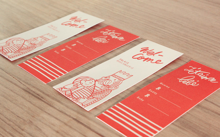
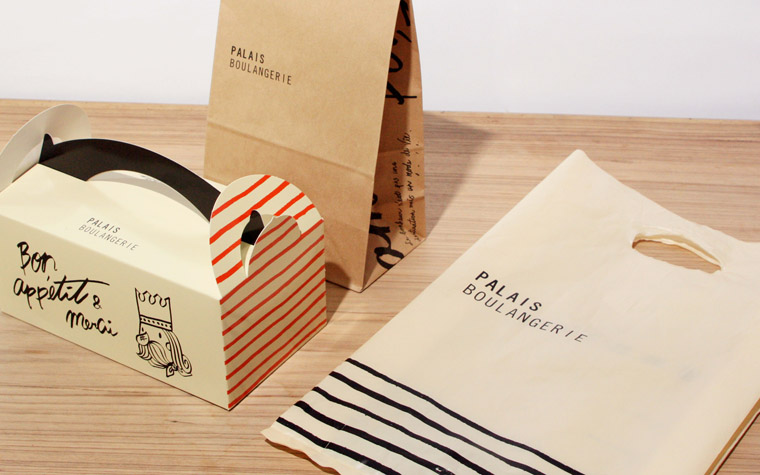
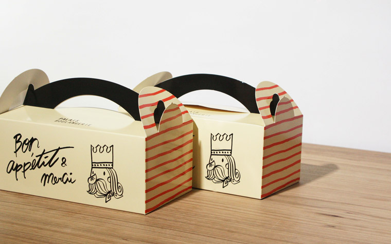
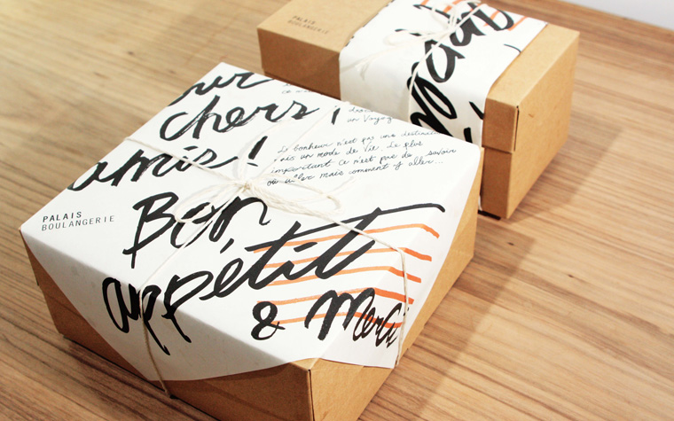
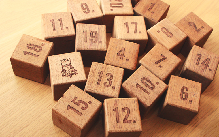
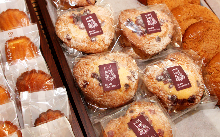
巴蕾的原意是「皇宮」,以前的識別是以「皇冠」作為象徵,更新後加入富有故事性的角色-熱愛麵包的頑皮國王,繫著麵包師的領巾,在華麗的禮服下,只穿著一件簡單的條紋T,讓品牌的特色更加鮮明。運用的色彩與包裝形式大多延續以往的規則,只增加了更輕便的包裝盒,從高階的禮盒到最平價的餐盒都能靈活展現各自的風情。
Unlike the rich array of products of Palais Boulangerie's first store, the recently opened second store focuses on more traditional European bread. In addition, coffee and light food are also offered,while multi-functional enable patrons to sit down and enjoy freshly made delicacies.
The CIS is also redesigned to match the current image; the logo consists of simple, neural English font to convey a sense of modernness and professional image, this is combined with rustic handwritten English and illustration to blend in the casual living attitude of coffee and light food. Palais means "palace", therefore the "crown" was used as the identification symbol previously, after the update, an intriguing character is introduced: The bread-loving, mischievous king, wearing a baker's scarf and a simple striped t-shirt underneath his extravagant outfit,the king has endowed the logo with a far more vivid character. The application of colors and packaging follow the previous rules, but the lighter, more portable packaging box is added, from top of the line gift box to the most affordable meal box, each design exuberates with unique flair.
