清平樂 Sole Balance 是新加坡足療品牌
創辦人是金融產業背景,相信能透過足療改善一個人的身心健康,這樣的幸福感比整天面對忙碌的金融數字更有意義。
品牌所要傳達的宗旨是,身(外在) 與心(內在) 必須達到平衡,才能使人健康。
品牌英文名 sole balance,sole代表腳,發音聽起來也像靈魂(soul)。中文名稱亦是如此,清除了身與心的阻礙,才能保持平衡與快樂。
足療,不僅僅是放鬆,透過腳底按摩和穴位按摩使身體恢復活力與體內經絡能量的平衡。
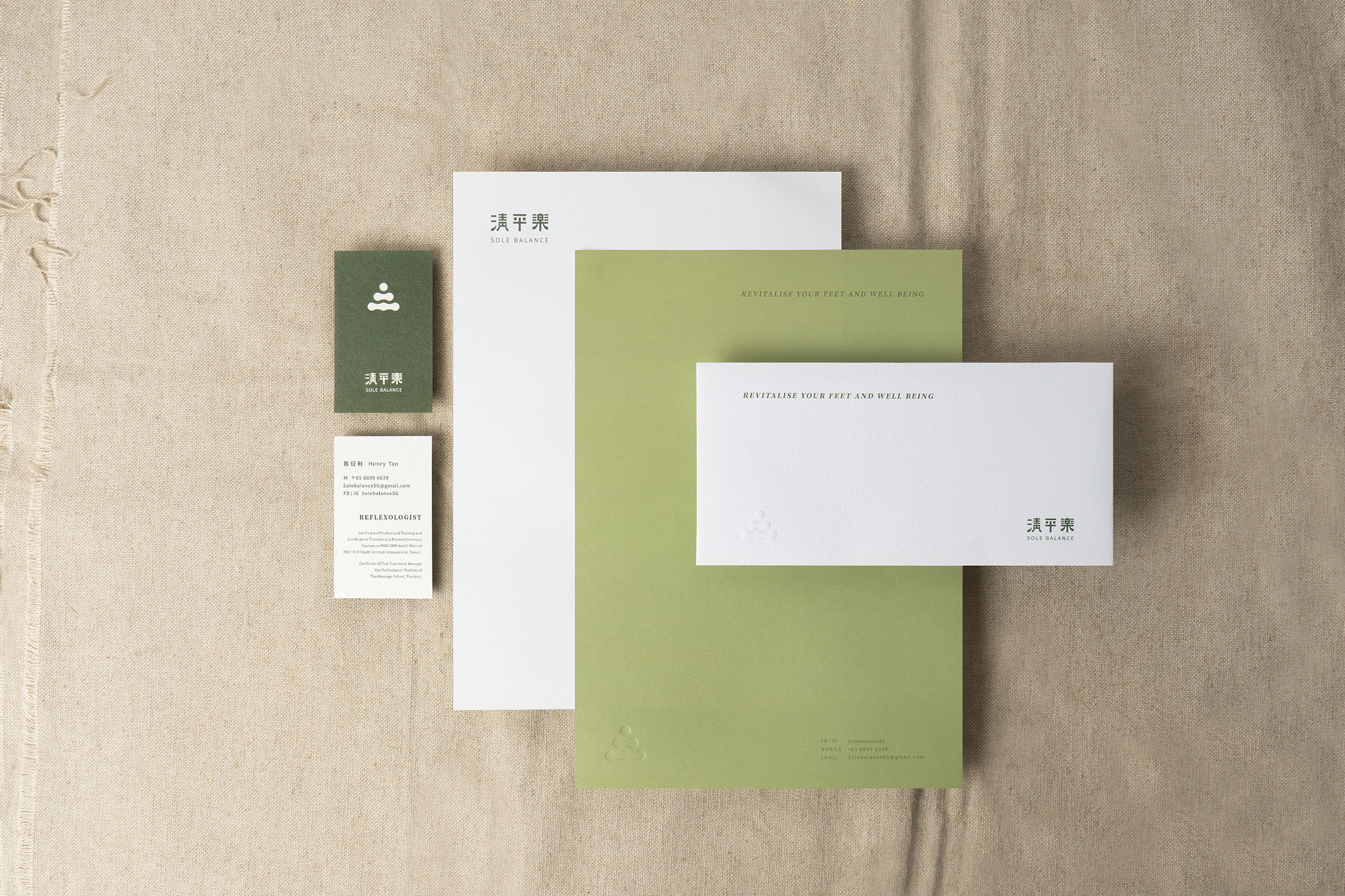
因品牌的製作物比較單純,設計著重於logo與色彩配置。
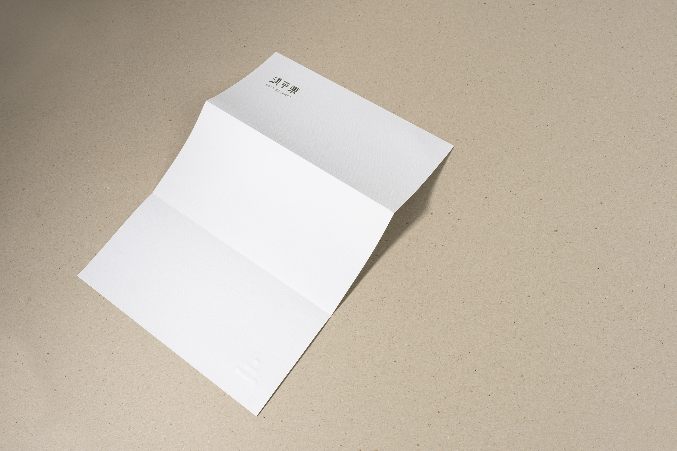
品牌標誌(logo) |
保留多重想像空間,可以說像人、山、水的流動、療程用的按摩器具 ....
品牌標準字|
紮實又溫潤的字體如同此品牌的內涵與厚度。
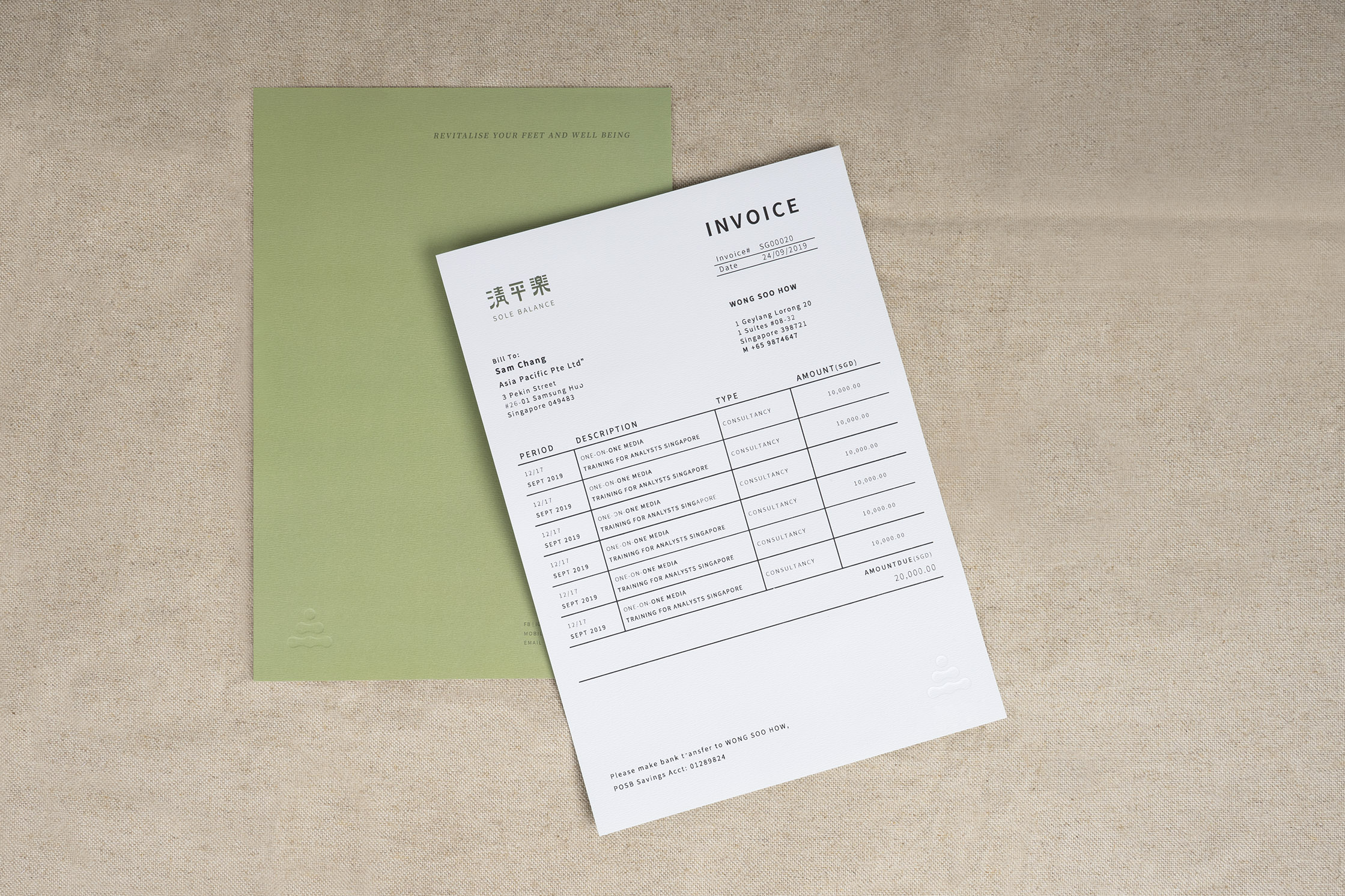
品牌色彩|
兩種不同層次的綠色與白色的搭配,讓人感到又沉靜又專業。
Sole Balance is a reflexology brand. Having a finance background, the founder later came to the realization that reflexology truly enhances people’s wellbeing both mentally and physically. Being a provider of this wholesomeness to people is more meaningful than juggling with digits in the finance world.
What the brand aims to communicate is the balance between the mind and the body that ultimately leads to health.
The English name of the brand ‘Sole Balance’ also implies the word ‘Soul’ besides ‘Sole’. Likewise, in the Chinese name of the brand, we want to communicate that the sole way to achieve happiness and peace is through elimination of distractions in the mind and the body.
More than relaxation, reflexology is a way to attain an energy balance in us and to restore vitality through foot massage and stimulation of pressure points.
In order to maintain the simplicity of the print collateral, the design of the identity relies heavily on the logo design and color palette.
Logo/ Leaving room for interpretation, the mark can be seen as people, mountain, flowing water and of course, massage equipment.
Wordmark/ A sturdy yet rounded typeface embodies the sophisticated and profound nature of the brand.
Color palette/ The two different layers of green and white in conjunction give a feeling of soundness and expertise.
創辦人是金融產業背景,相信能透過足療改善一個人的身心健康,這樣的幸福感比整天面對忙碌的金融數字更有意義。
品牌所要傳達的宗旨是,身(外在) 與心(內在) 必須達到平衡,才能使人健康。
品牌英文名 sole balance,sole代表腳,發音聽起來也像靈魂(soul)。中文名稱亦是如此,清除了身與心的阻礙,才能保持平衡與快樂。
足療,不僅僅是放鬆,透過腳底按摩和穴位按摩使身體恢復活力與體內經絡能量的平衡。
因品牌的製作物比較單純,設計著重於logo與色彩配置。
品牌標誌(logo) |
保留多重想像空間,可以說像人、山、水的流動、療程用的按摩器具 ....
品牌標準字|
紮實又溫潤的字體如同此品牌的內涵與厚度。
品牌色彩|
兩種不同層次的綠色與白色的搭配,讓人感到又沉靜又專業。
Sole Balance is a reflexology brand. Having a finance background, the founder later came to the realization that reflexology truly enhances people’s wellbeing both mentally and physically. Being a provider of this wholesomeness to people is more meaningful than juggling with digits in the finance world.
What the brand aims to communicate is the balance between the mind and the body that ultimately leads to health.
The English name of the brand ‘Sole Balance’ also implies the word ‘Soul’ besides ‘Sole’. Likewise, in the Chinese name of the brand, we want to communicate that the sole way to achieve happiness and peace is through elimination of distractions in the mind and the body.
More than relaxation, reflexology is a way to attain an energy balance in us and to restore vitality through foot massage and stimulation of pressure points.
In order to maintain the simplicity of the print collateral, the design of the identity relies heavily on the logo design and color palette.
Logo/ Leaving room for interpretation, the mark can be seen as people, mountain, flowing water and of course, massage equipment.
Wordmark/ A sturdy yet rounded typeface embodies the sophisticated and profound nature of the brand.
Color palette/ The two different layers of green and white in conjunction give a feeling of soundness and expertise.