渡辺屋和牛咖哩麵包
WATANABE YA
branding, graphic design
2019
Art Director
余岱官 Kuan
Designer
余岱官 Kuan (品牌視覺、核心規劃)
高懷瑾 (製作物設計)
汪平 (標準字設計)
Illustrator
楊振華老師 (Logo人像插圖)
Photography
高懷瑾
WATANABE YA
branding, graphic design
2019
Art Director
余岱官 Kuan
Designer
余岱官 Kuan (品牌視覺、核心規劃)
高懷瑾 (製作物設計)
汪平 (標準字設計)
Illustrator
楊振華老師 (Logo人像插圖)
Photography
高懷瑾
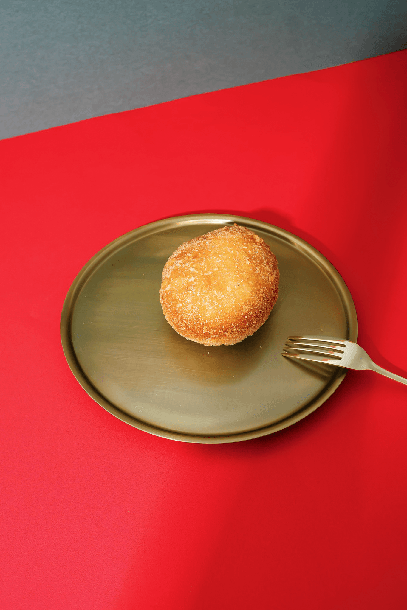
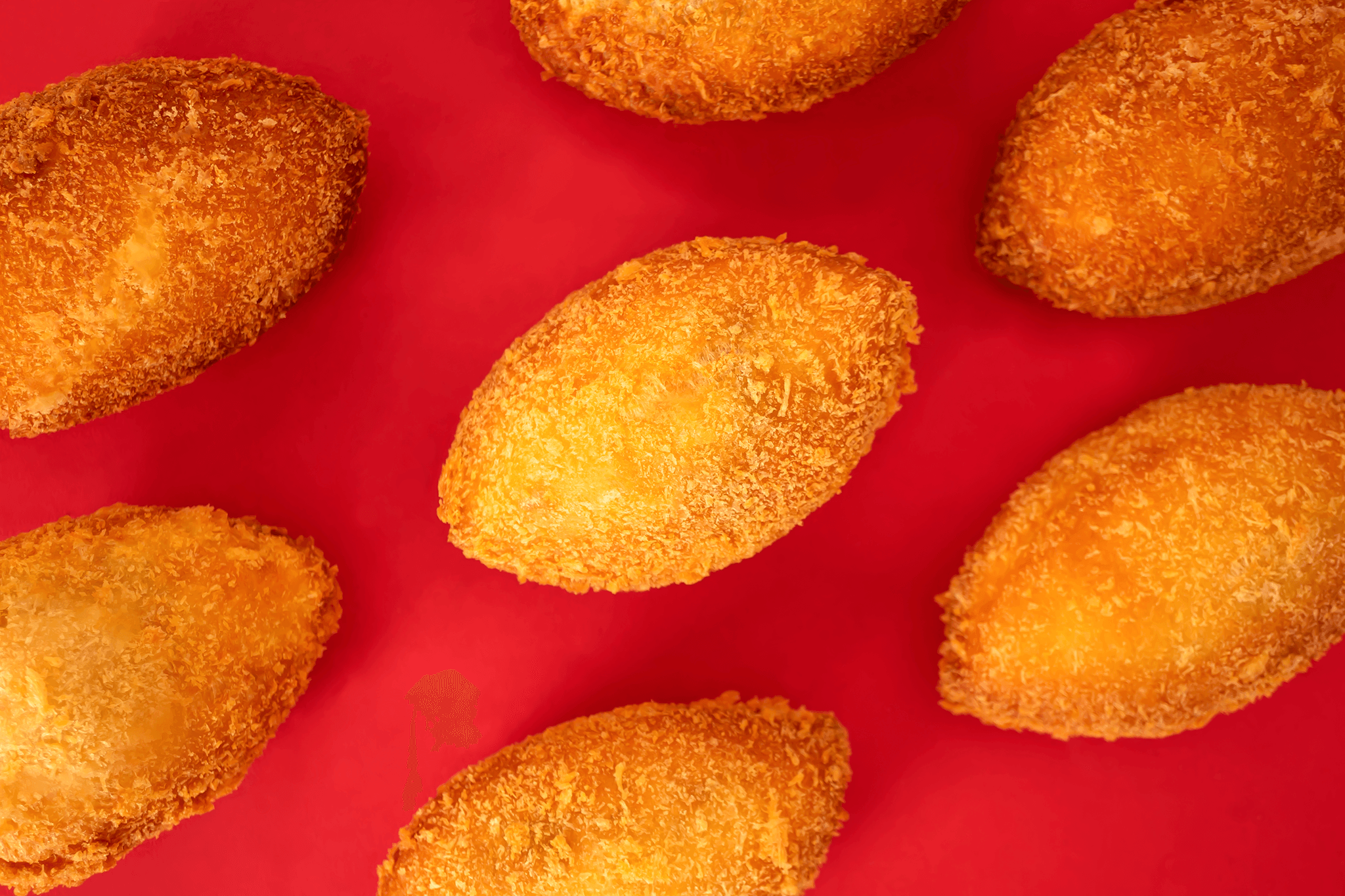
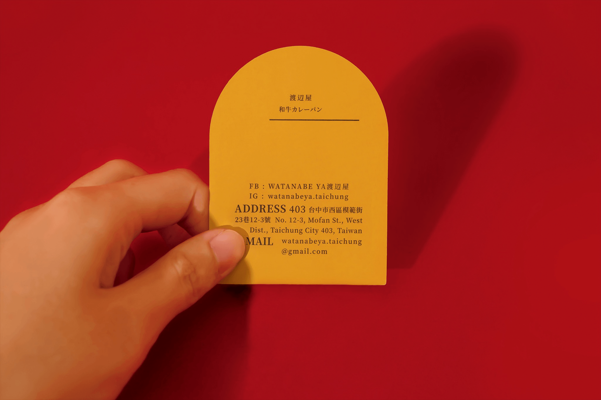
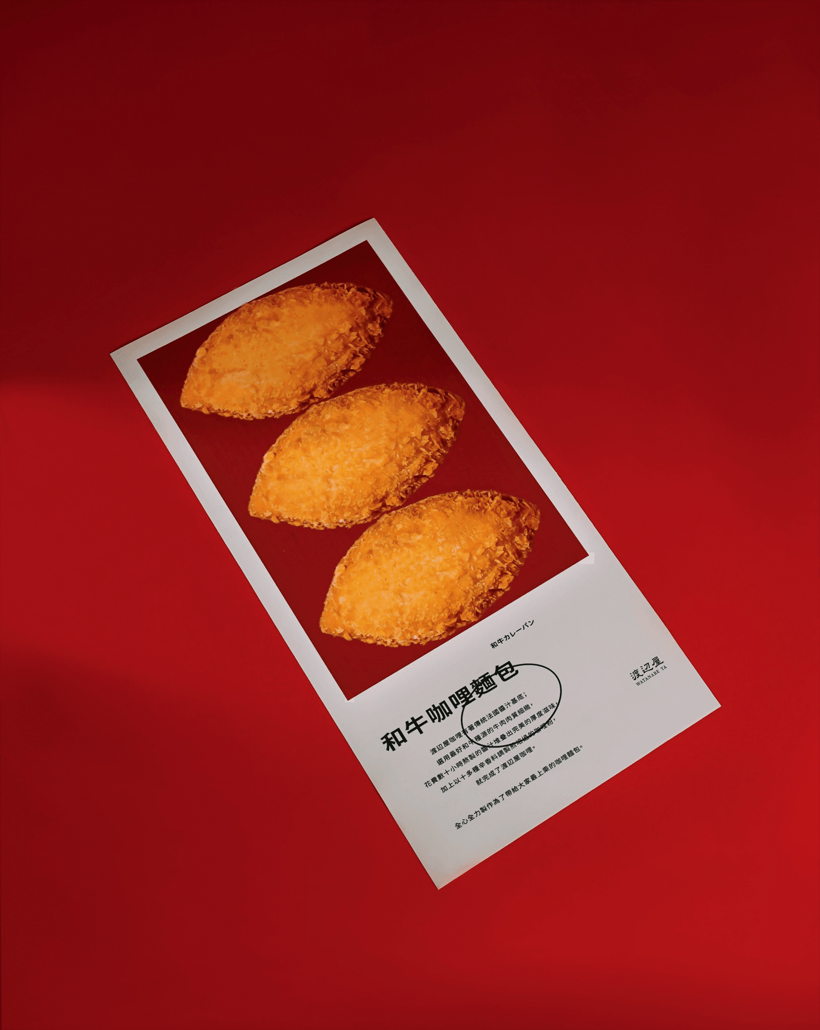
嚴選品質優良的的和牛與豬肉以及花費數十小時熬製的傳統法國醬汁基底,
延續 LA PASSAGE 的創業精神,渡辺屋將有著法國料理功夫的咖哩麵包介紹給台灣人。
前衛(個性)卻經典 - 女主理人新時代獨立女性的特質
貴族氣質 - 使用上等的食材與高級料理的烹飪精神
法日混血 - 日本主廚傳承歐式烹調手法的和洋食
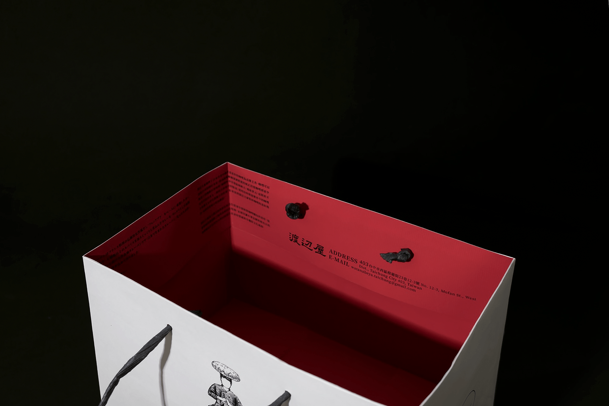
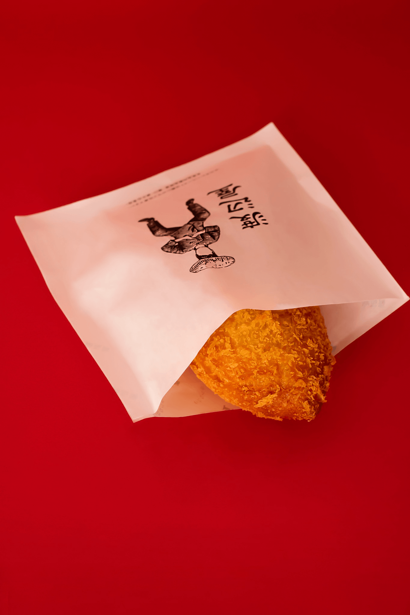
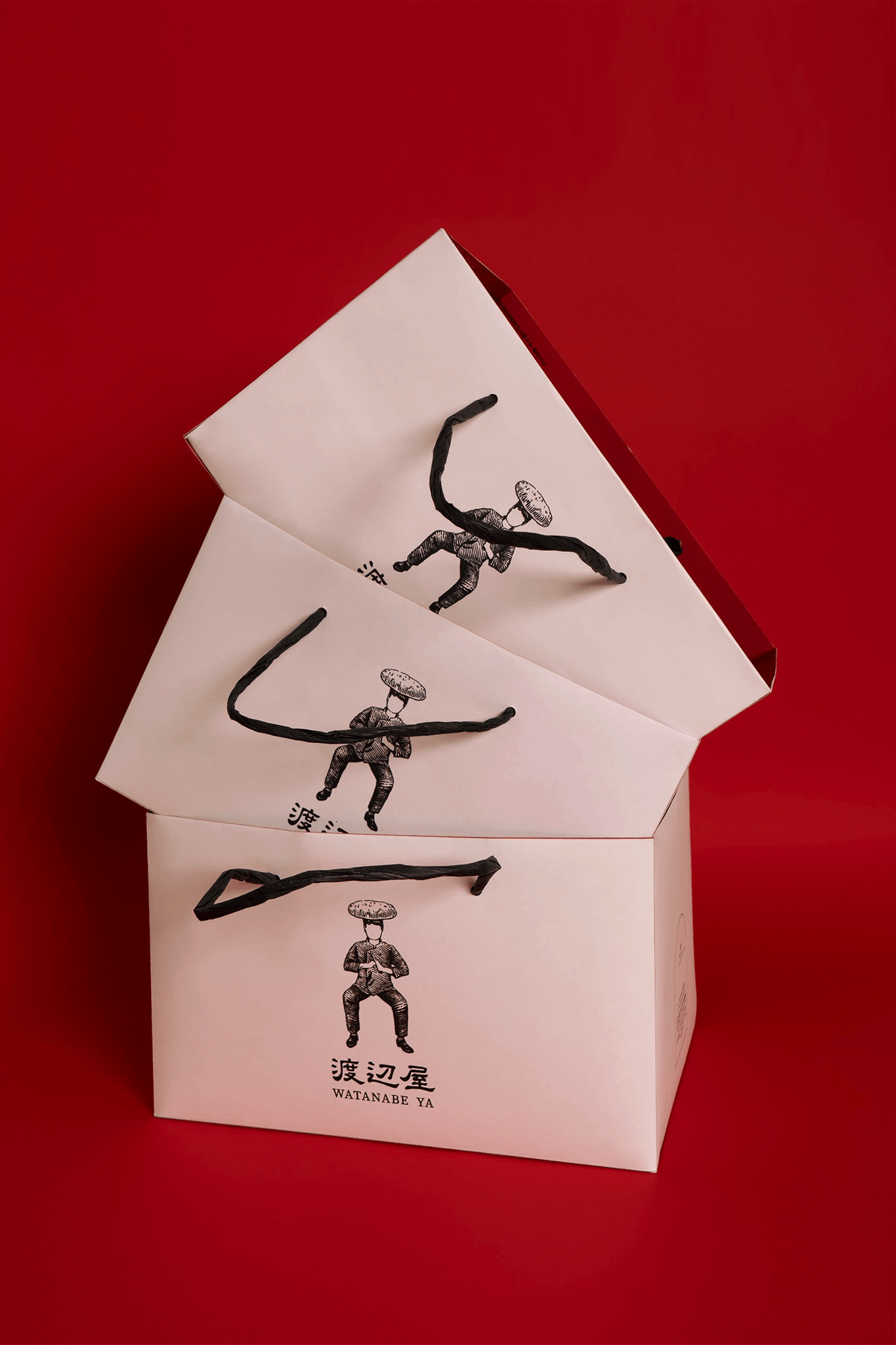
我們把渡辺主廚的詼諧放大成品牌一大特點表現在logo,
以歐洲版畫呈現 頭頂麵包、蹲馬步姿勢的反差感,形成有趣的文化風格,
第一眼令人摸不著頭緒的趣味中,流露出法國料理細膩高檔的形象。
功夫姿勢象徵主廚全心全力製作,只為了帶給大家最上乘的咖哩麵包。
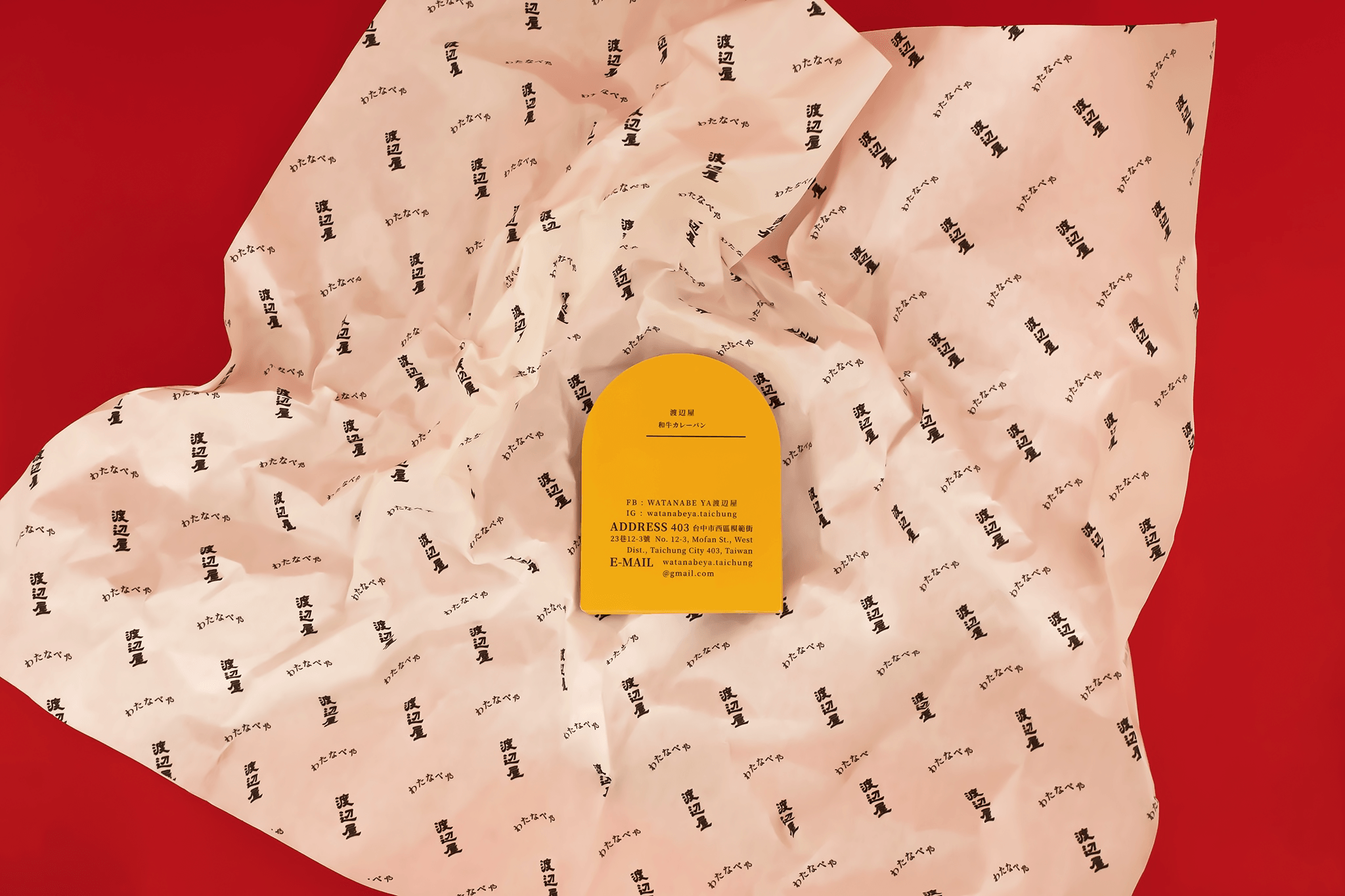
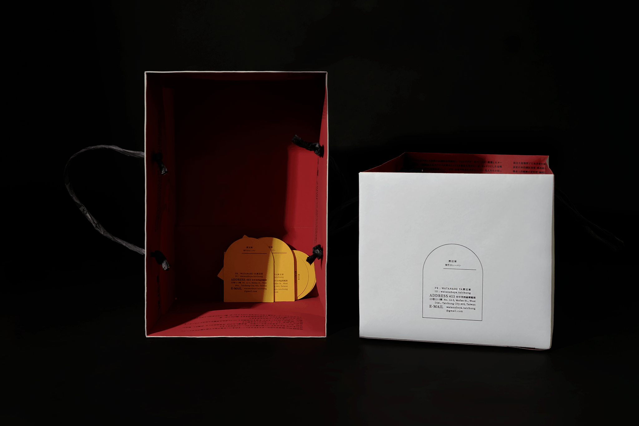
而提袋的內折處滿版的品牌文字,富有文學與藝術氣息,也是出自女主理人的哲學、藝術背景。
Meticulously selected Wagyu beef and pork in a traditional French broth cooked over hours,
La Passage stands by its company ethos from day one, providing Taiwanese people with the exquisite artisanal French curry bread.
Brand elements:
Forward yet classic – the owner’s contemporary female ideals
Regal disposition – the use of top-shelf ingredients and methodology of the culinary arts
Japanese and French fusion – Japanese chef inherits European cooking style with the fusion of western cuisine.
2Tigers Design brought light to Watanabe Ya by emphasizing the sense of humor Chef Watanabe has in its logo. Inspired by European gravure printing, with the subject carrying a loaf of bread on its head and a half kneel posture, the imagery makes up a fun and contrast one. On first sight, the viewer may feel slightly confused with its subject matter, but the overall high-brow art feel juxtaposes beautifully with the fun subject.
The kungfu-esque posture signifies the devotion of the chef in his art, and his commitment to only bringing the best to his patrons.
The descriptions in the folds of the paper bags provide a glimpse of literature and artistry from the owner’s philosophy and art background.
延續 LA PASSAGE 的創業精神,渡辺屋將有著法國料理功夫的咖哩麵包介紹給台灣人。
前衛(個性)卻經典 - 女主理人新時代獨立女性的特質
貴族氣質 - 使用上等的食材與高級料理的烹飪精神
法日混血 - 日本主廚傳承歐式烹調手法的和洋食
我們把渡辺主廚的詼諧放大成品牌一大特點表現在logo,
以歐洲版畫呈現 頭頂麵包、蹲馬步姿勢的反差感,形成有趣的文化風格,
第一眼令人摸不著頭緒的趣味中,流露出法國料理細膩高檔的形象。
功夫姿勢象徵主廚全心全力製作,只為了帶給大家最上乘的咖哩麵包。
而提袋的內折處滿版的品牌文字,富有文學與藝術氣息,也是出自女主理人的哲學、藝術背景。
Meticulously selected Wagyu beef and pork in a traditional French broth cooked over hours,
La Passage stands by its company ethos from day one, providing Taiwanese people with the exquisite artisanal French curry bread.
Brand elements:
Forward yet classic – the owner’s contemporary female ideals
Regal disposition – the use of top-shelf ingredients and methodology of the culinary arts
Japanese and French fusion – Japanese chef inherits European cooking style with the fusion of western cuisine.
2Tigers Design brought light to Watanabe Ya by emphasizing the sense of humor Chef Watanabe has in its logo. Inspired by European gravure printing, with the subject carrying a loaf of bread on its head and a half kneel posture, the imagery makes up a fun and contrast one. On first sight, the viewer may feel slightly confused with its subject matter, but the overall high-brow art feel juxtaposes beautifully with the fun subject.
The kungfu-esque posture signifies the devotion of the chef in his art, and his commitment to only bringing the best to his patrons.
The descriptions in the folds of the paper bags provide a glimpse of literature and artistry from the owner’s philosophy and art background.