Babyface手工喜餅彌月蛋糕
_店鋪設計
Babyface handmand dessert_Store Identity
store identity, wedding
2019
Art Director
余岱官 Kuan
Designer
余岱官 Kuan
Photography
Joe Wu Photography 、Babyface
Babyface handmand dessert_Store Identity
store identity, wedding
2019
Art Director
余岱官 Kuan
Designer
余岱官 Kuan
Photography
Joe Wu Photography 、Babyface
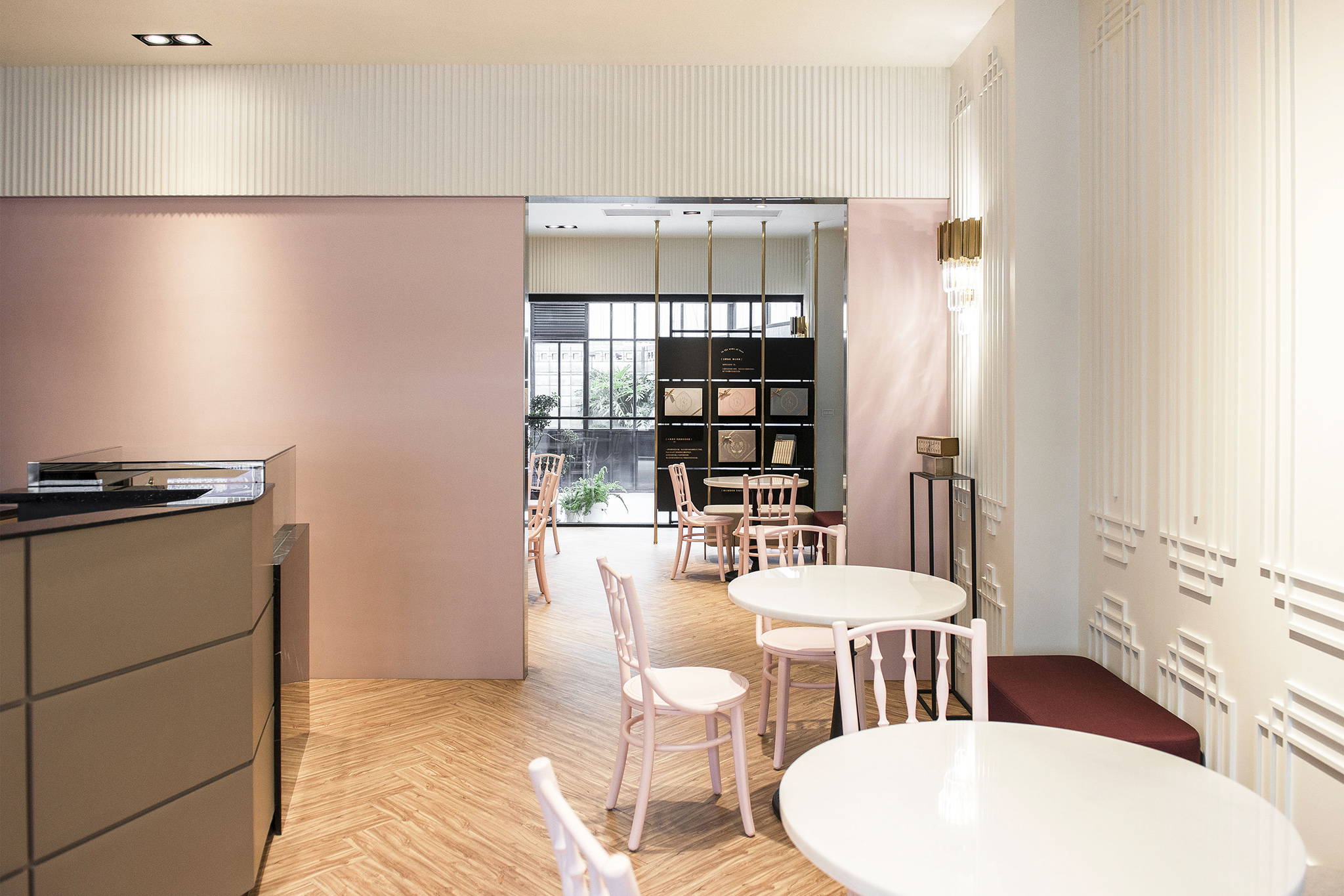
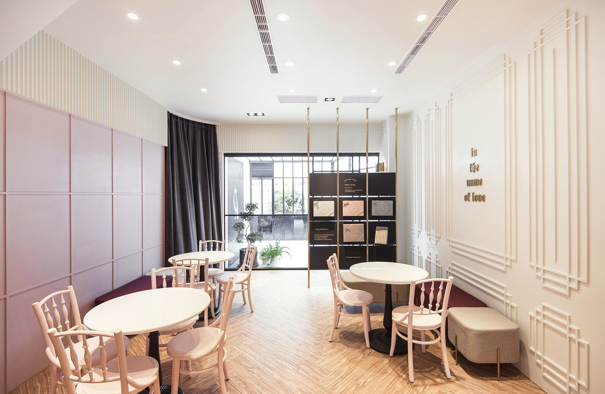
Babyface品牌調性塑造為歐式、低調奢華,
並有帶有獨特個性之artdeco風情,既摩登又復古。
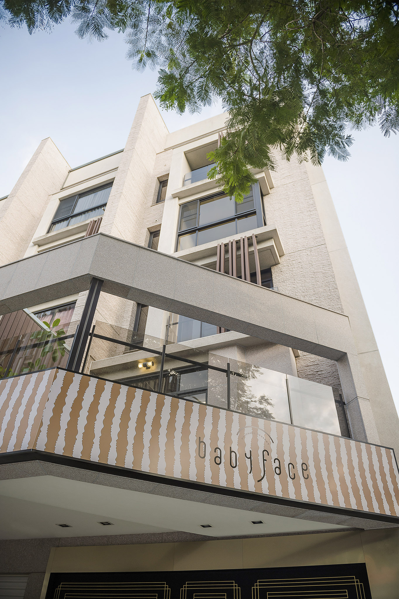
店舖為品牌重要呈現,更能完整訴說品牌氛圍。
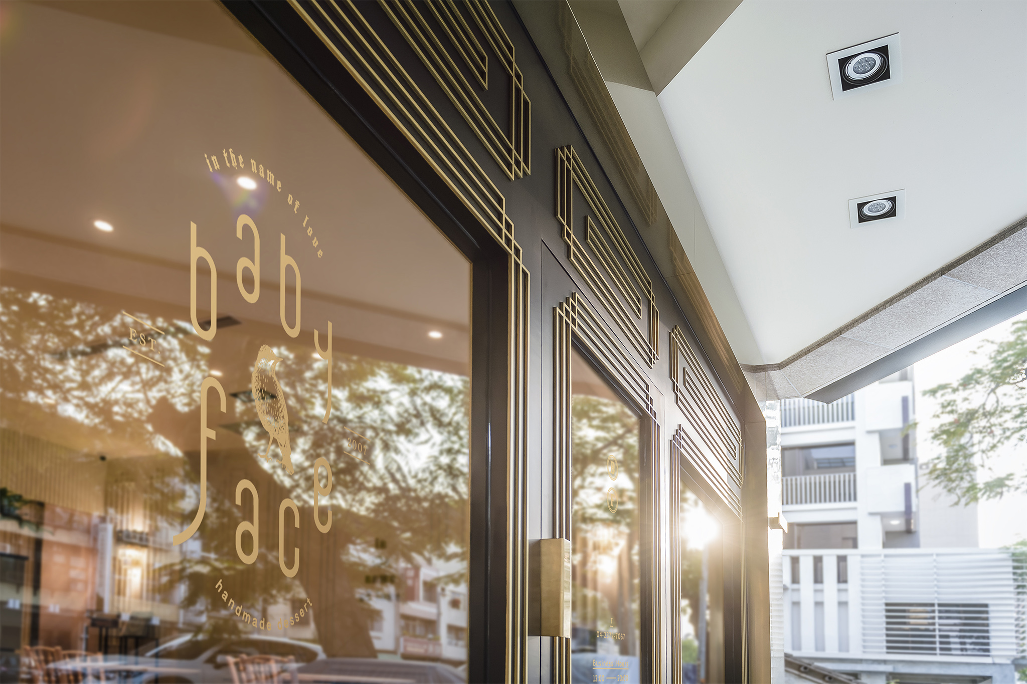
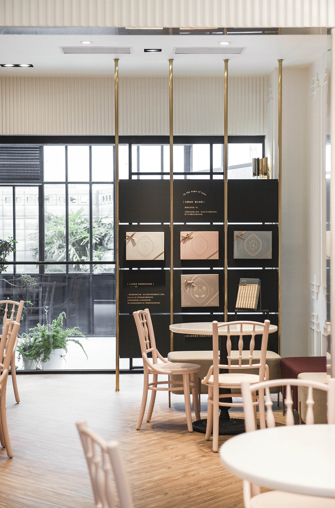
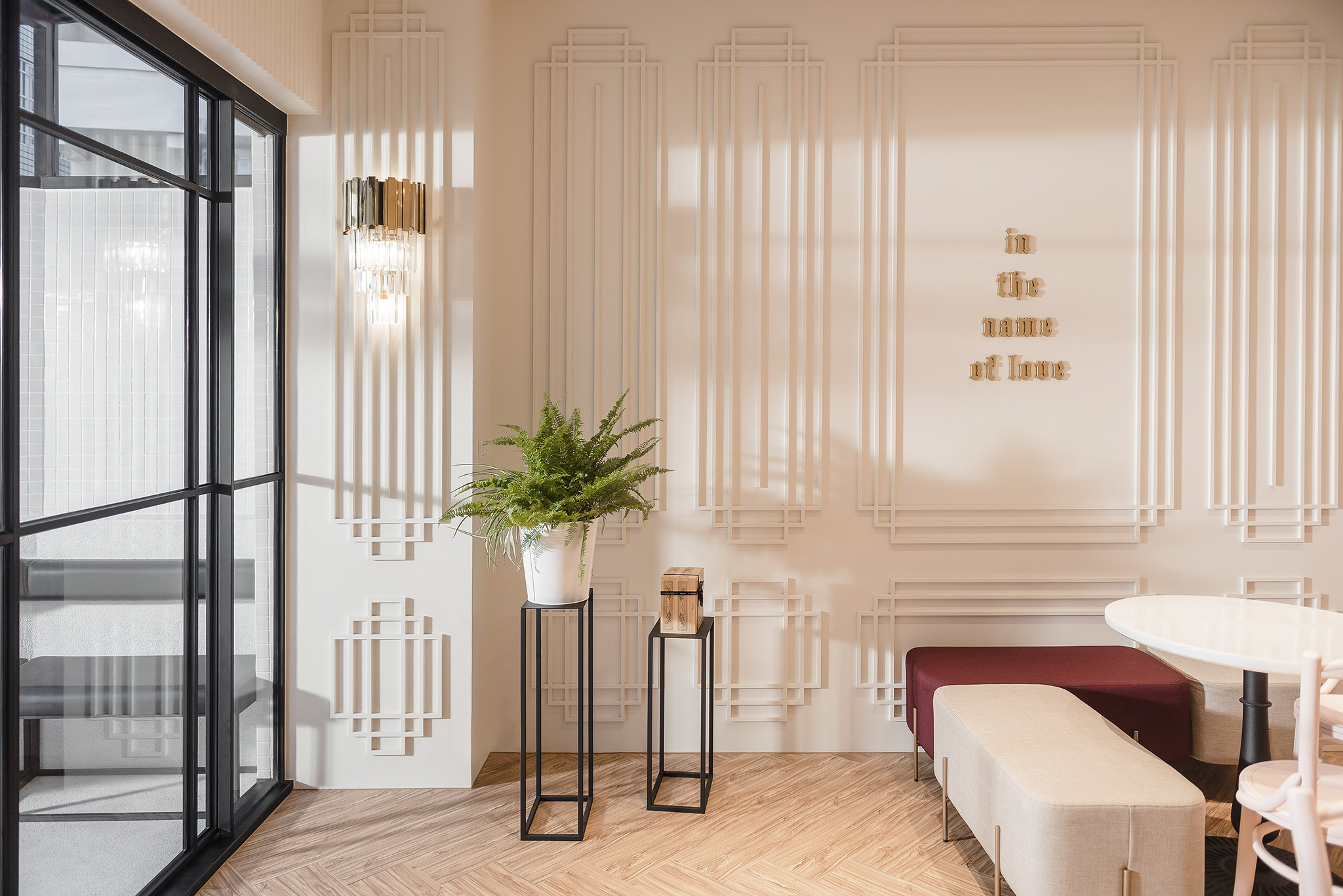
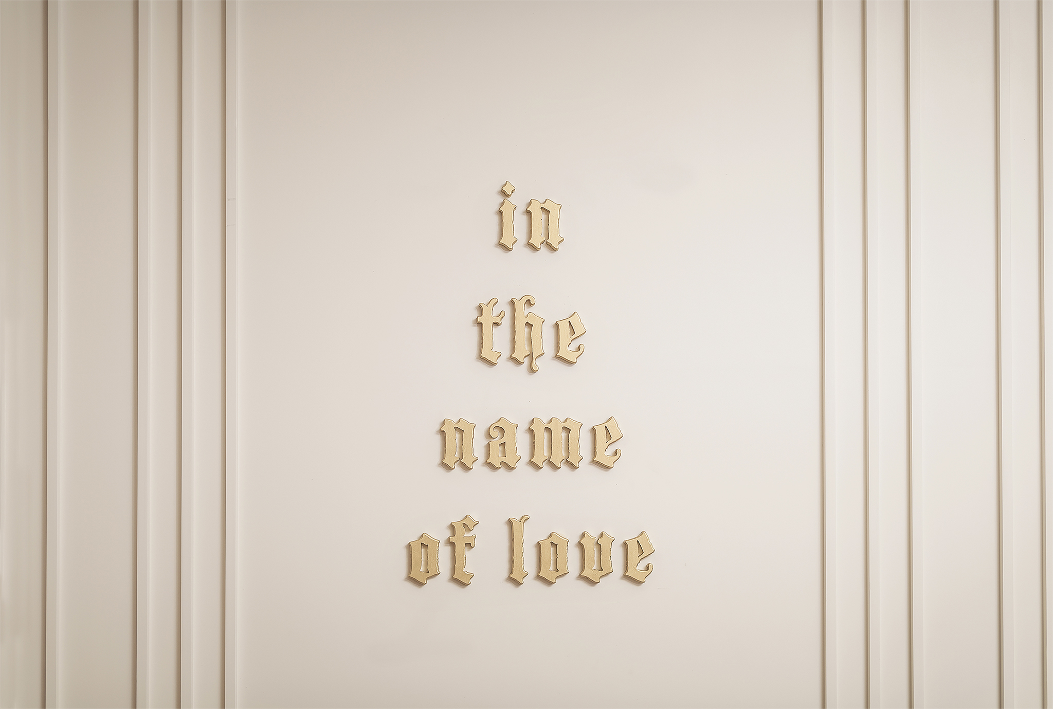
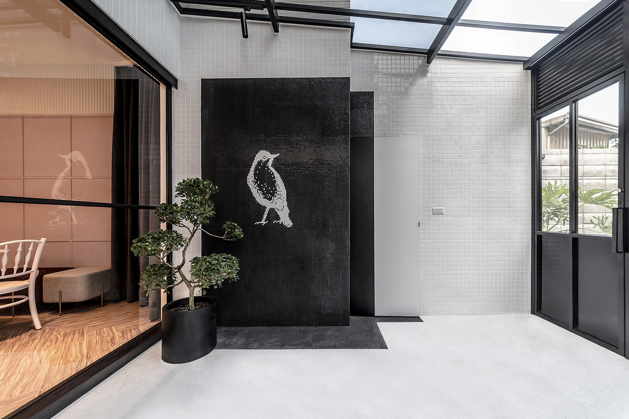
門面與室內之裝飾牆皆延續了包裝上的artdeco風情裝飾線條,使用不同色調營造出的不同氣質。
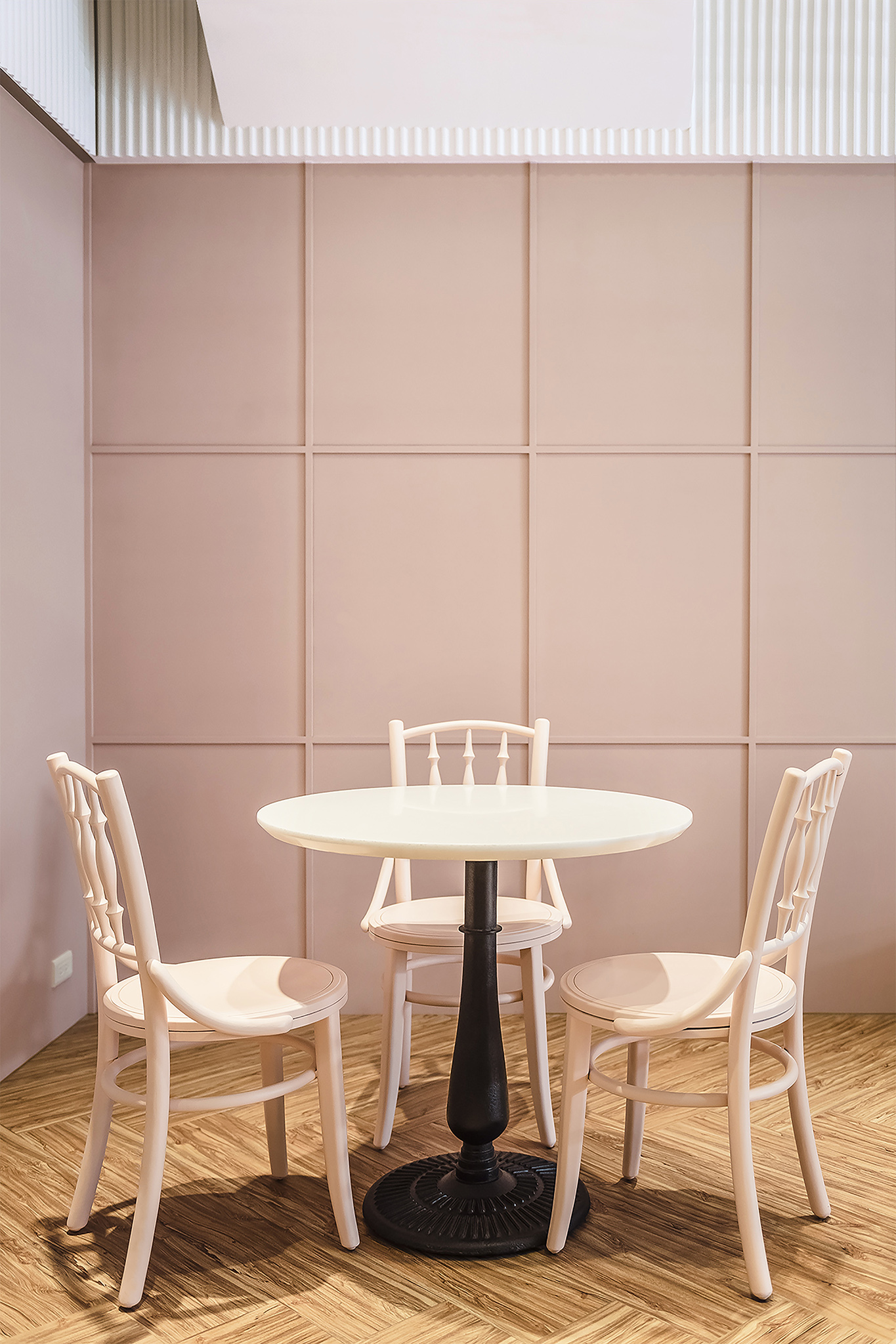
室內營造了婚禮柔軟幸福感與精品氛圍,同時呈現品牌內涵且能將禮盒陳列融為室內設計一部份。
因為建築物本體不能有太多改變,為了增加吸睛度,門面使用黑與金的濃郁奢華創造視覺重點。
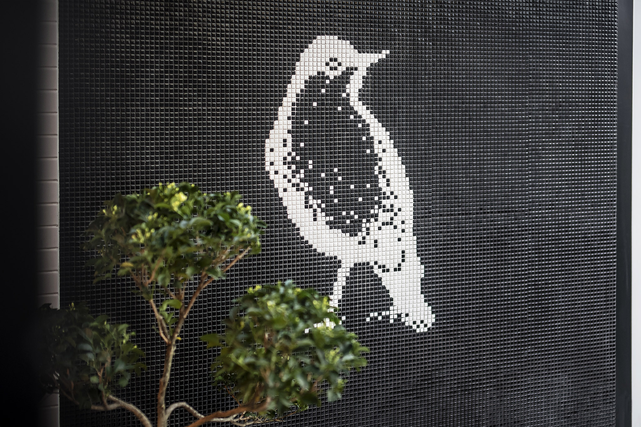
代表品牌logo之青鳥,亦使用不同材質與表現。
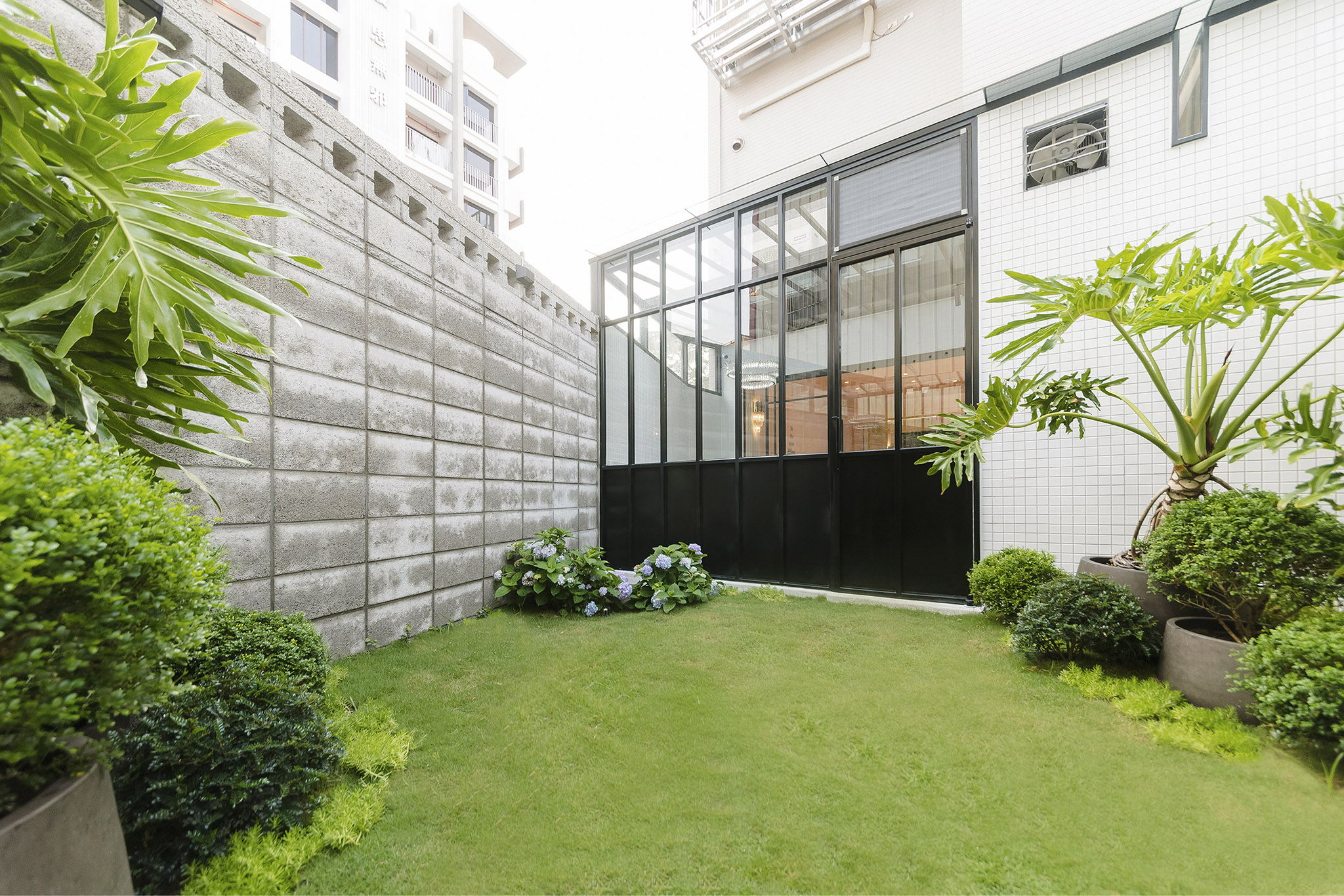
後花園整體營造時尚與個性,與室內空間有不同情調並悄悄帶出業主喜好。
讓每位新人前來時,都感受幸福溫暖氣息並備受尊寵,享受與眾不同的氣質。
並有帶有獨特個性之artdeco風情,既摩登又復古。
店舖為品牌重要呈現,更能完整訴說品牌氛圍。
門面與室內之裝飾牆皆延續了包裝上的artdeco風情裝飾線條,使用不同色調營造出的不同氣質。
室內營造了婚禮柔軟幸福感與精品氛圍,同時呈現品牌內涵且能將禮盒陳列融為室內設計一部份。
因為建築物本體不能有太多改變,為了增加吸睛度,門面使用黑與金的濃郁奢華創造視覺重點。
代表品牌logo之青鳥,亦使用不同材質與表現。
後花園整體營造時尚與個性,與室內空間有不同情調並悄悄帶出業主喜好。
讓每位新人前來時,都感受幸福溫暖氣息並備受尊寵,享受與眾不同的氣質。
The identity of babyface handmade desserts is one of European inspired luxury done in a subdued fashion.
With art deco-inspired elements, a contemporary and retro feeling is brought to the the interior of the store.
Therefore, the overall identity of the brand is more vividly expressed.The art-deco motifs are extended from the dessert packaging. Colors are used to convey different personalities.
Through the interior design, the joy of newlyweds and an exclusive experience are evidently felt by patrons.Due to the technical constraints of the building, much of the building structure is built in place.
Therefore, in order to create more visual interests, black and gold are used heavily in the storefront design to emphasize the richness and luxury of the brand.The signature bluebird graphic is also incorporated in the store design made of mosaic to set apart from the rest of the store.
The back patio creates a stylish and quirky space, setting itself apart from the indoor space and also reflecting the owner’s quirky nature. Overall, the unique and fashion forward space invites people in with its lively character.