Babyface 手工喜餅 彌月蛋糕
Babyface handmade dessert
brand strategy, branding, rebranding,
package design, wedding
2016 - 2017
Art Director
余岱官 Kuan
Designer
余岱官 Kuan
Photography
汪平
Brand Image Photography
莊少橙
Babyface handmade dessert
brand strategy, branding, rebranding,
package design, wedding
2016 - 2017
Art Director
余岱官 Kuan
Designer
余岱官 Kuan
Photography
汪平
Brand Image Photography
莊少橙
創立於2007年 rebranding 幸福不難找,幸福就在我們身邊。 當我們付出,幸福就在身邊 ; 當我們踏實的生活著,幸福就在身邊 ; 因為踏實,因為付出,堆疊出了10年後的babyface。
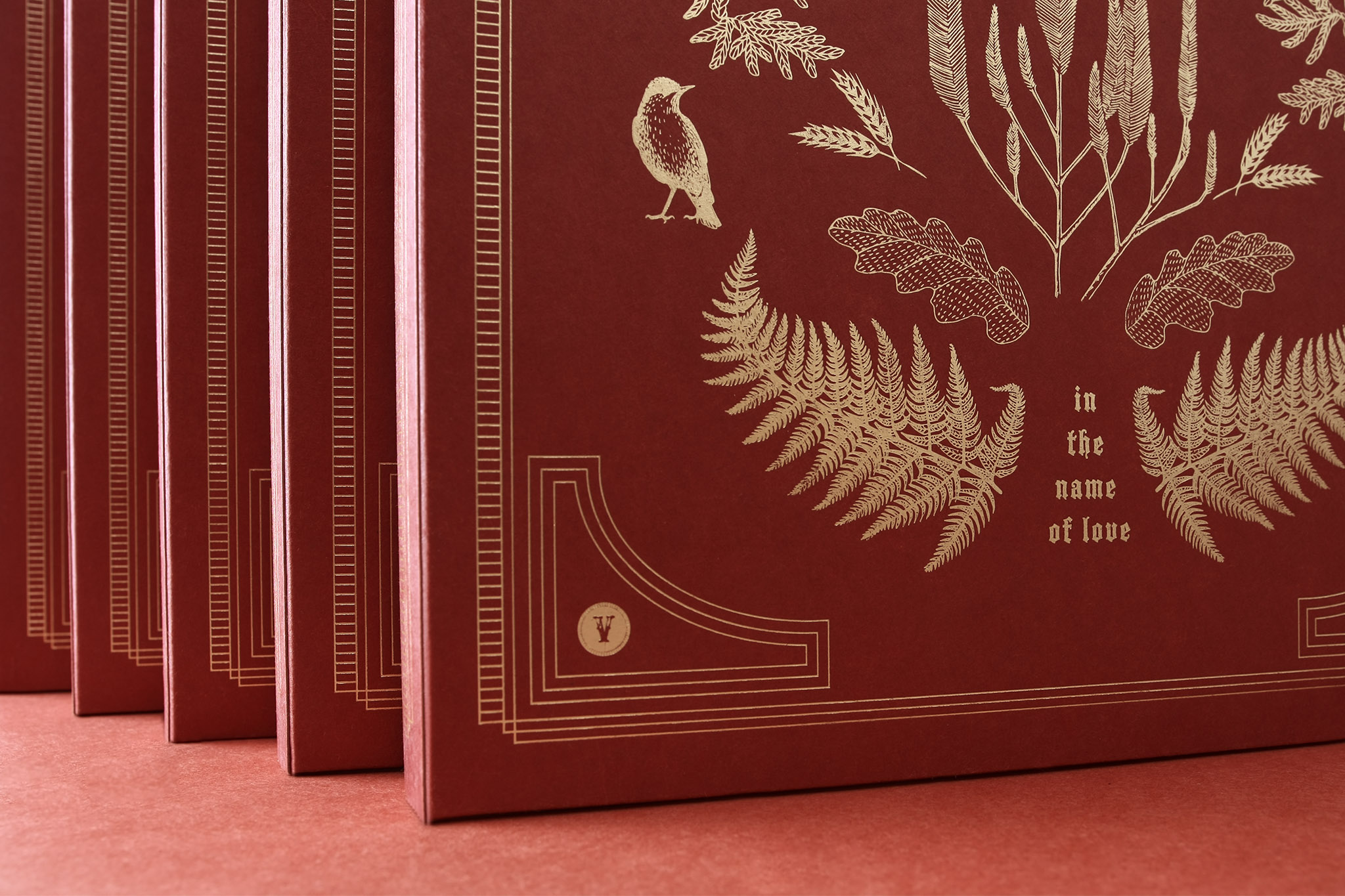
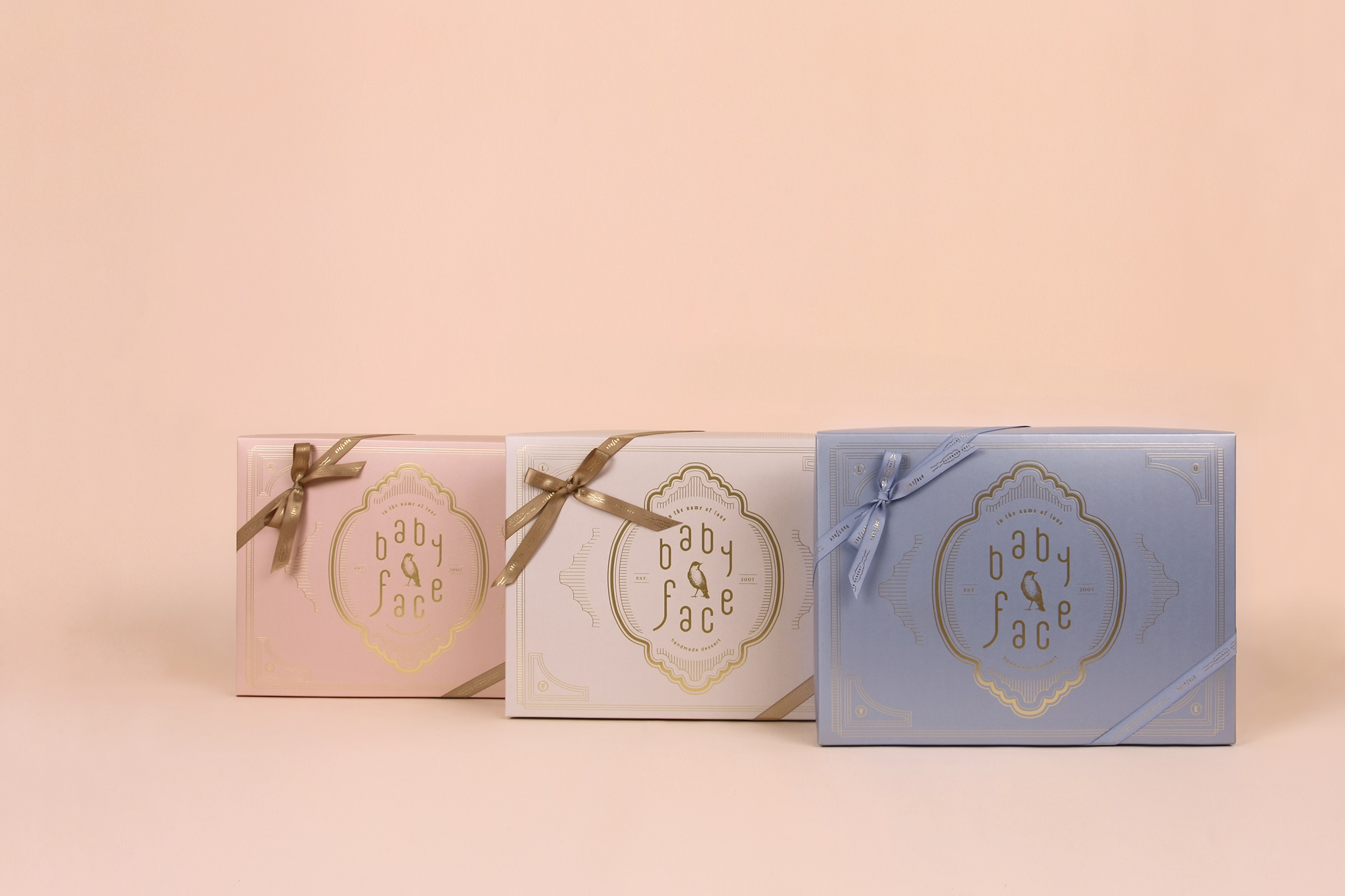
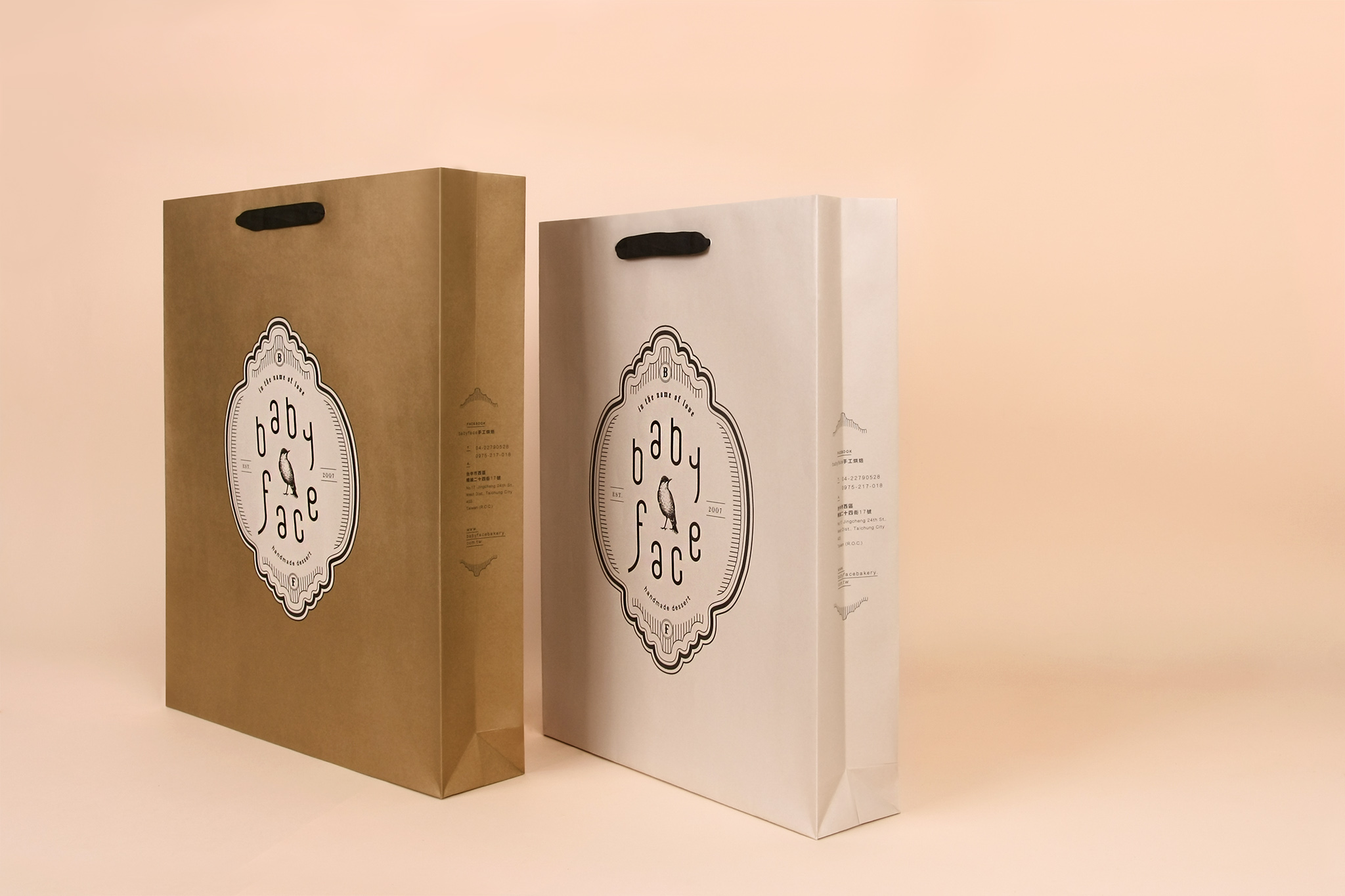
品牌視覺主要元素有: babyface側臉線條 / 青鳥 / 花園 / 裝飾性框線 與表現低調奢華的低彩度的配色,也因為其中細節藏著主理人的個性感,讓品牌呈現除了 歐式/古典/雋永/時尚外,還有帶著與眾不同的獨特氣質。
| babyface側臉線條 | 組成歐式logo外框與米白金色交錯的復古年代視覺感。
| 青鳥 | 幸福的象徵 堅定的姿態
| 花園 | 主理人喜愛的元素,也一直呈現於店內 ; 也是另一種幸福感的表徵。 蘆薈花{形狀像燭台,有歐式奢華感}+松柏葉+厥類...等,以中性的植物來表現業主堅定與踏實性格。
| 裝飾性線條 | 簡約線條歐式框,平衡一些花園的古典歐式風,讓整體多一些的時尚感。
Babyface handmade dessert Founded in 2007 Rebranding It is not hard to find happiness for it is there by our side. Through giving, happiness appears next to us. Through down-to-earth living, happiness appears next to us. Because of grounded living and giving, through a decade, babyface has built its presence today. The main elements of the brand's visual identity are as follows: Babyface Side Face Silhouette/Bluebird/Garden/Decorative Frame and Lines. With understated luxurious low-brightness colors, hiding within details of the principal’s personal style, the design presents the brand an European/classic/timeless/trendy sense, as well as a unique distinctive sophistication.
| Babyface Side Face Silhouette | The European-style logo frame overlapped with beige white gold colors, compose a vintage visual feel.
| Bluebird | A symbol of happiness in a determined posture.
| Garden | The principal's favorite elements are permanently displayed in the store; it also symbolizes another sense of happiness. Aloe flower {shaped like a candlestick, a sense of European luxury} + pine and cypress leaves + fern species, etc. , adopting neutral style plants to demonstrate the persistent and down-to-earth personality of the principal.
| Decorative Lines | A European frame in simple lines, balances the classic European garden style to enhance the overall look with a sense of trendiness.