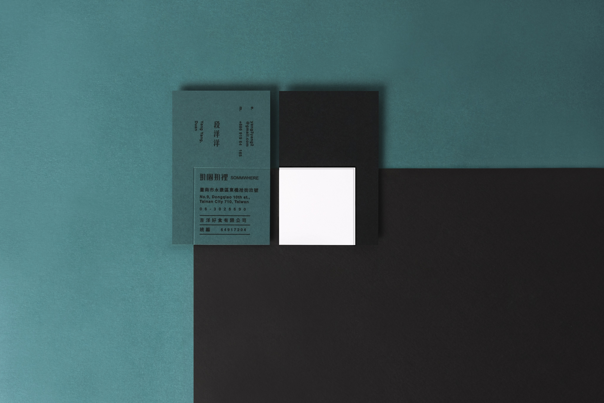
“那個那裡”為主理人家中長輩的生活用語習慣,somm. 為sommelier 伺酒師的縮寫,表達經營者伺酒師身份 ; 主理人俏皮使用成為品牌名,正好表現品牌的專業與輕鬆的生活哲學。
sommwhere那個那裡是紅酒、法式甜點的雜貨店,販售與分享經營者多年的生活經驗與好食材。 葡萄酒的世界裡,帶著各地的歷史、地理、人文,更藏著無盡的人生哲學。 不同的生活經驗與許多不同,而有各種的滋味與感受,這也是品嚐與生活的樂趣。
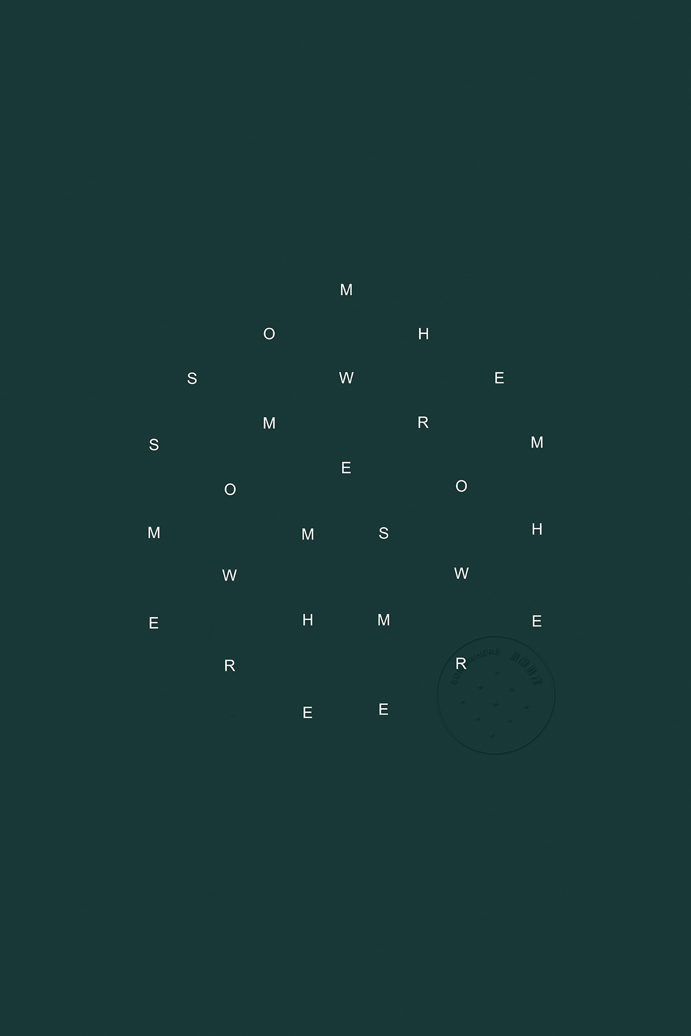
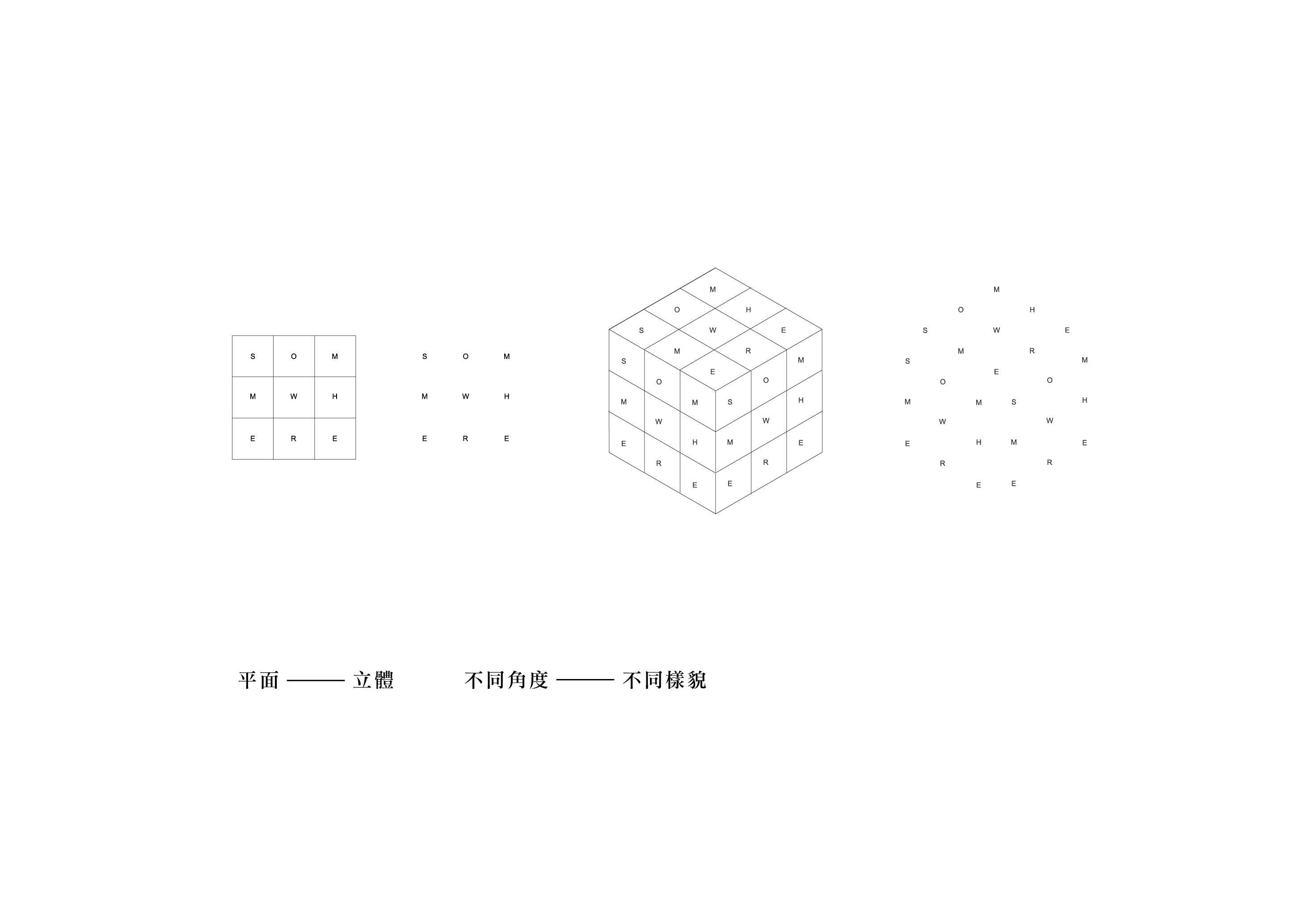
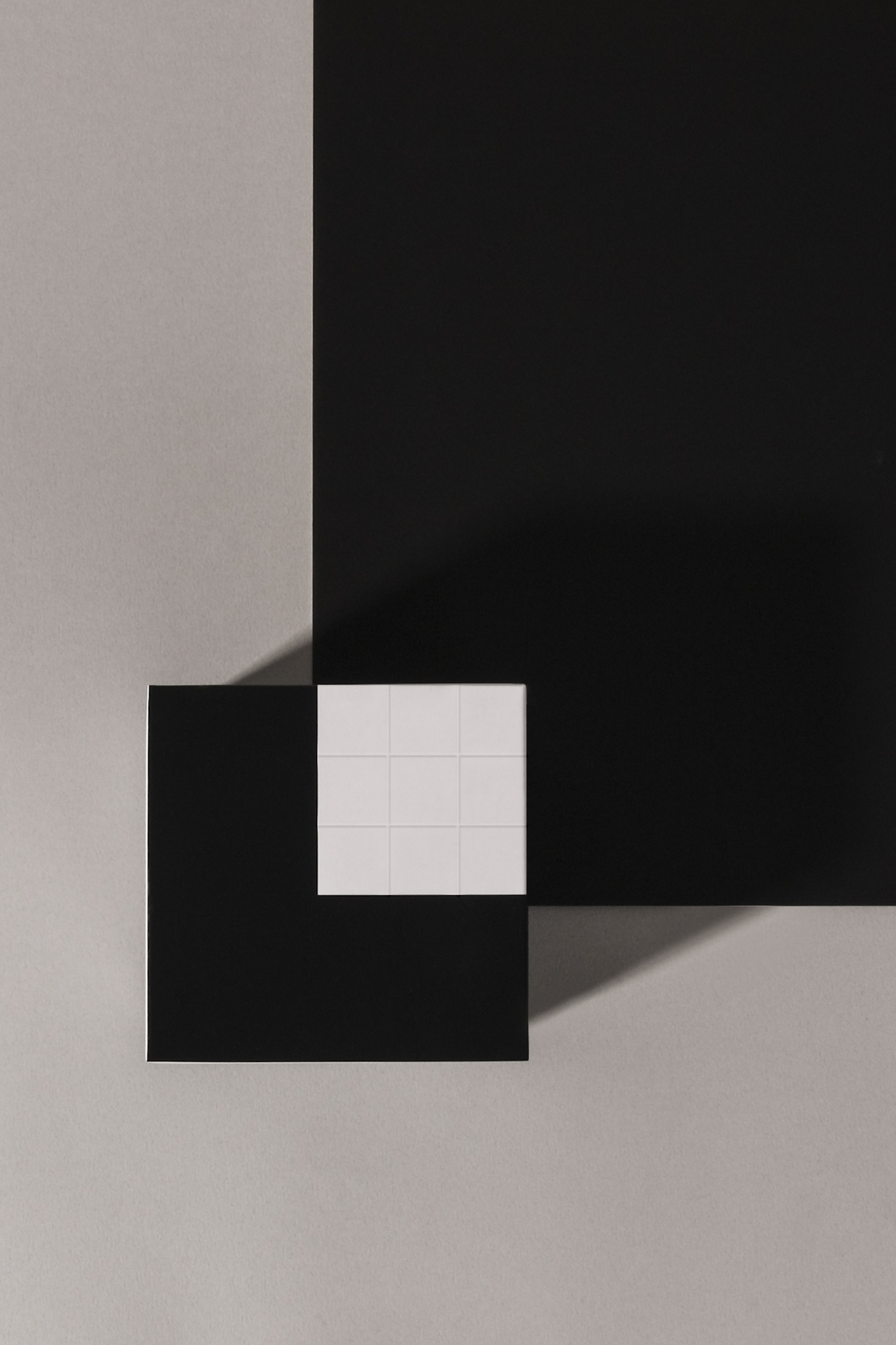
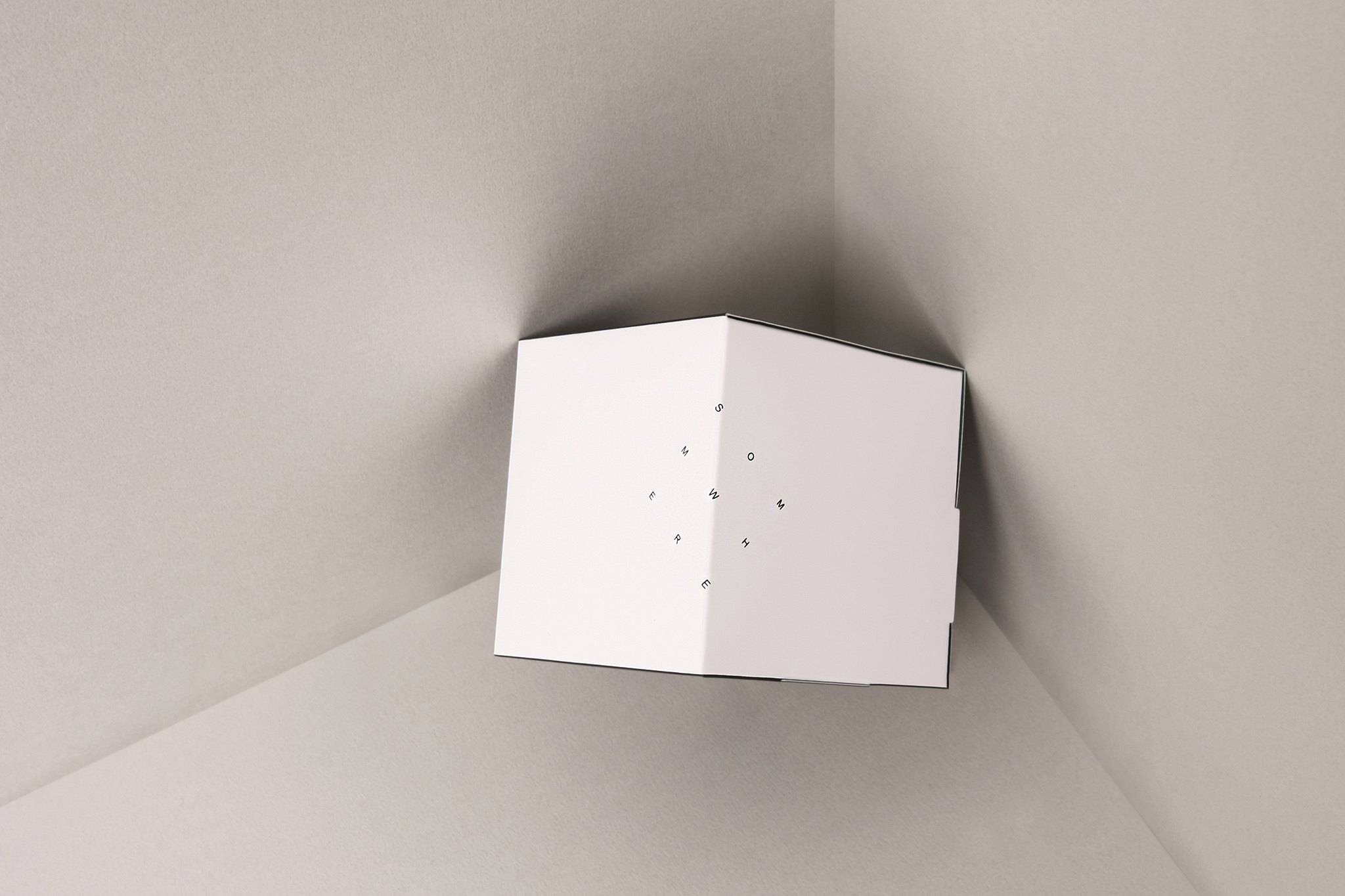
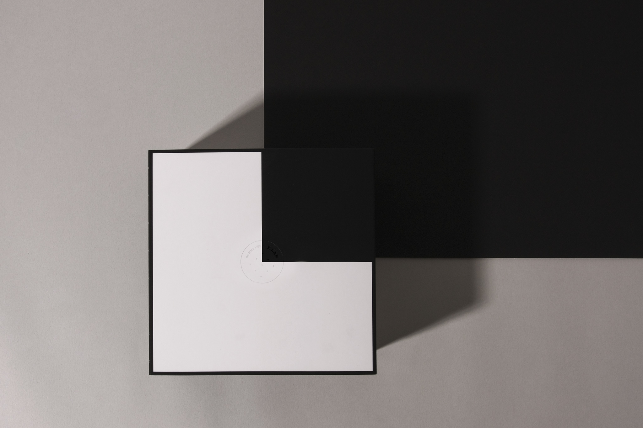
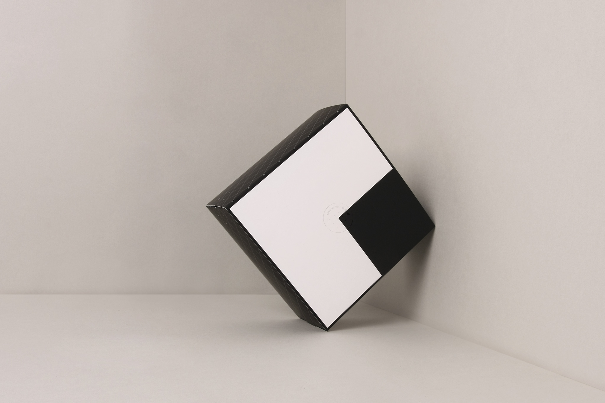
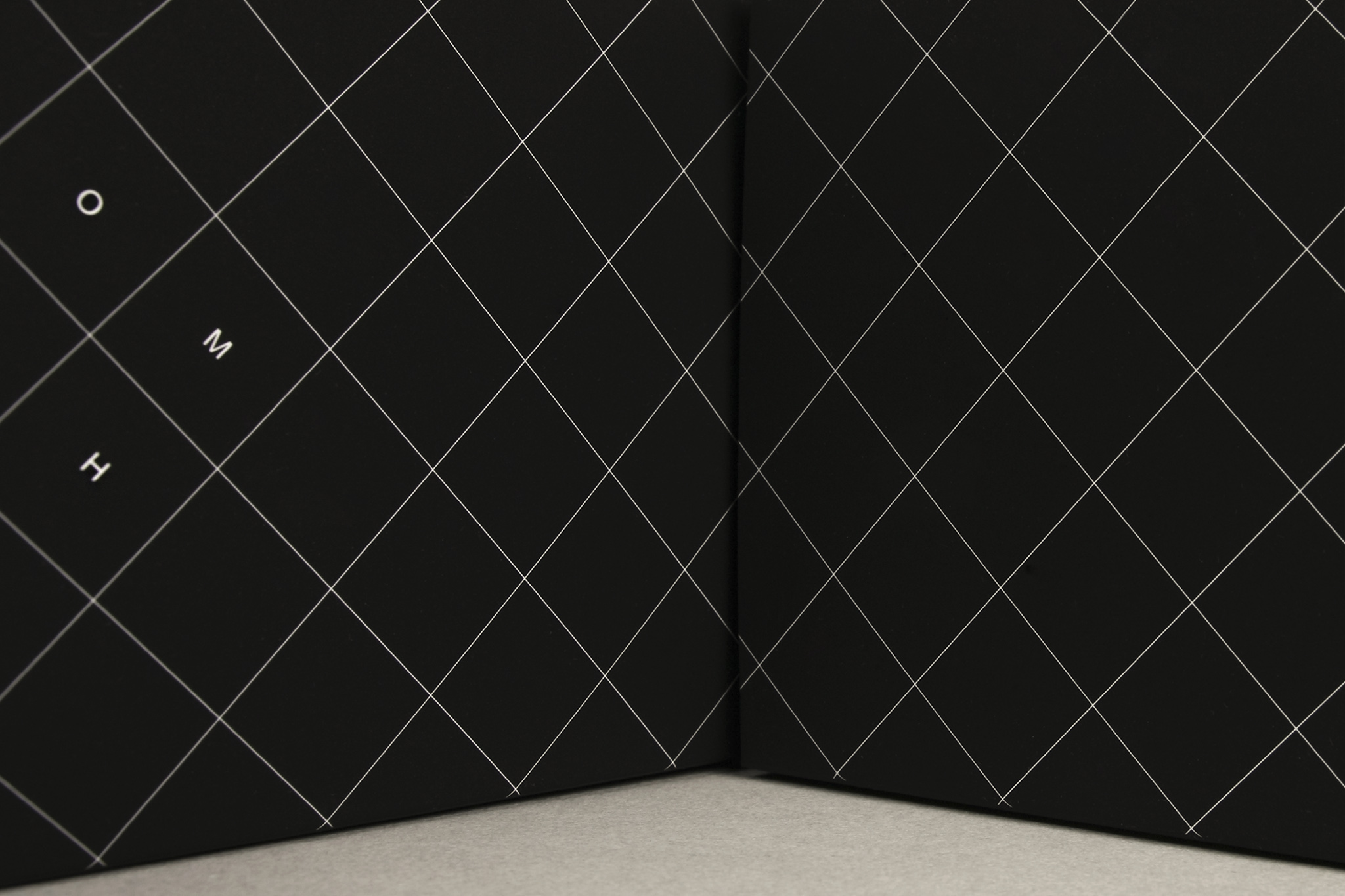
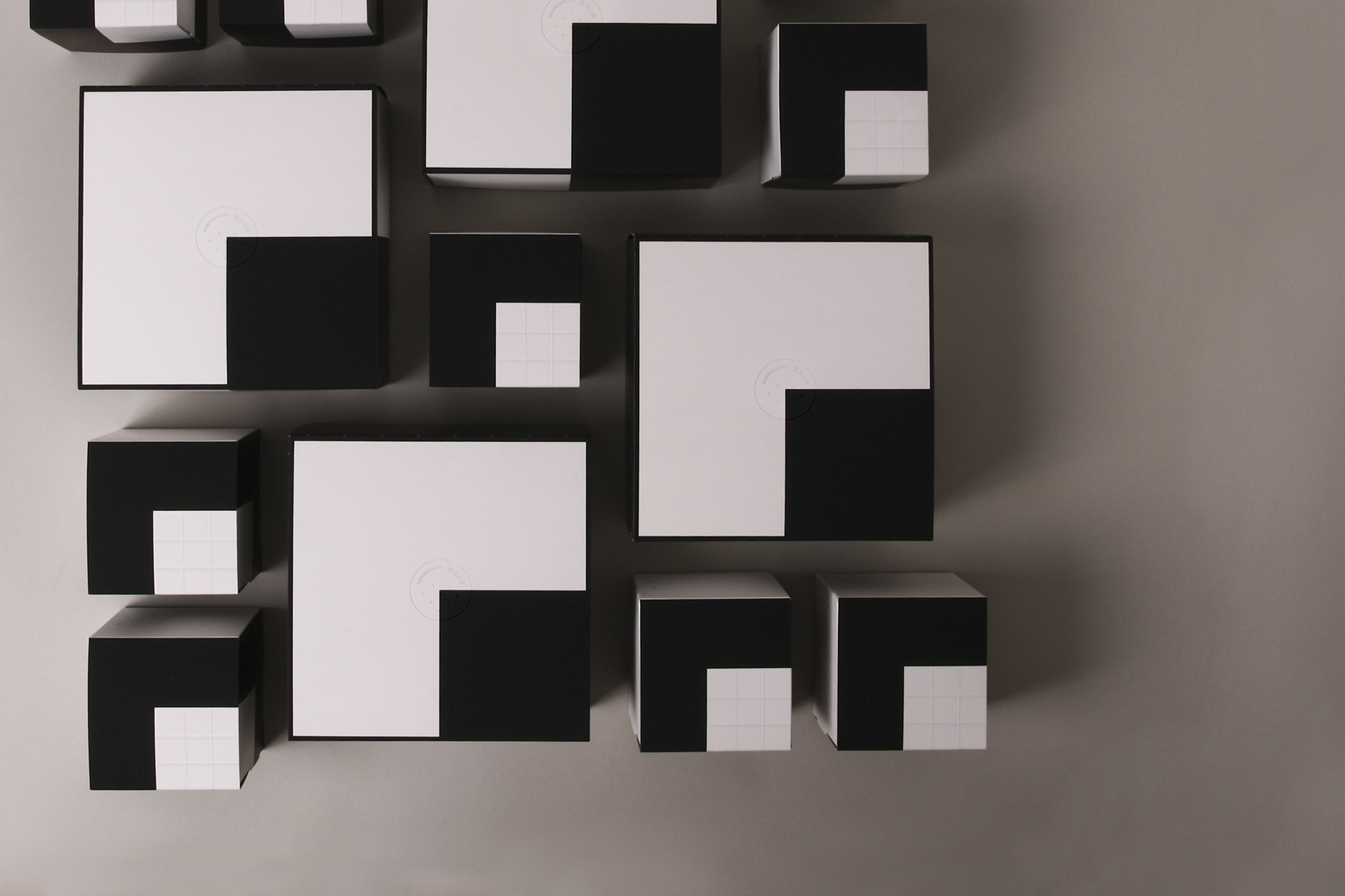
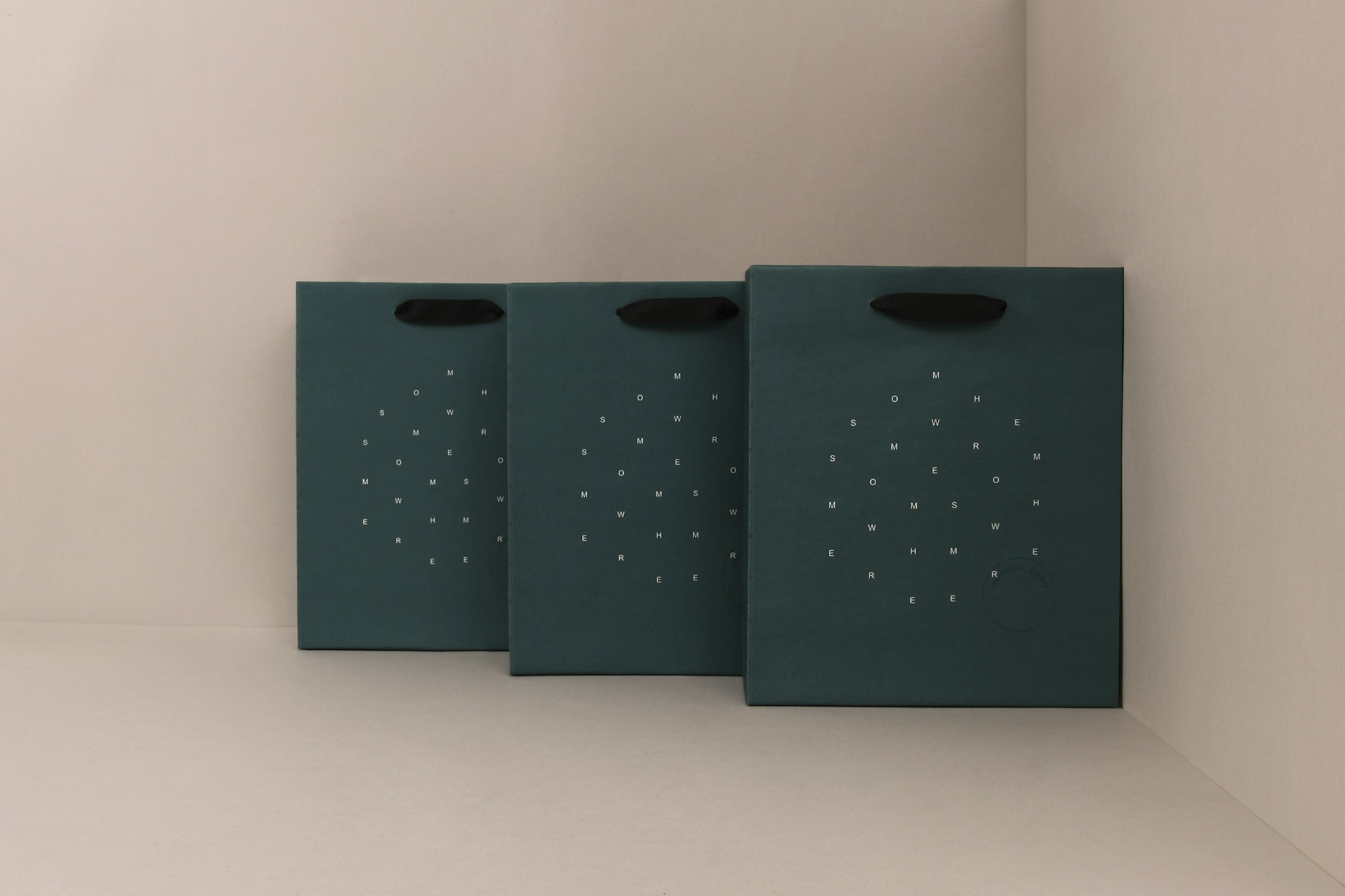
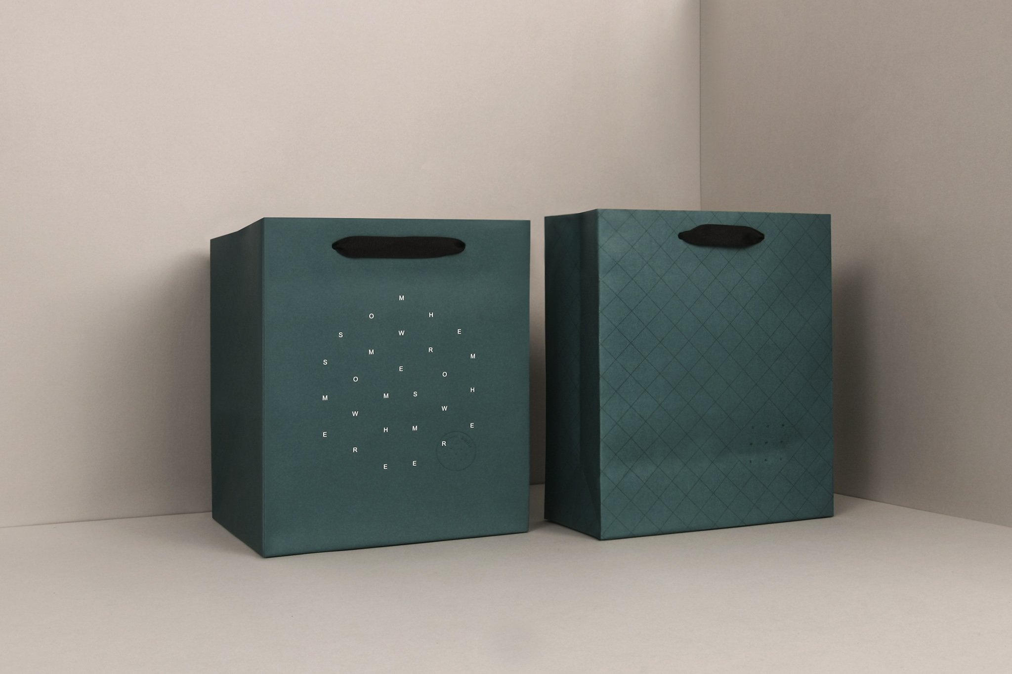
立體的每一面是平面, 平面與立體看起來相同卻又不同 , 不同角度 有 不同樣貌 ; 如葡萄酒 如人生哲學。logo表現平面立體這樣的概念,主理人喜愛的菱格紋,也悄悄的與logo運用於包裝之中。白+特別的綠色,表現主理人的俐落、獨特與好品味。
Enjoy!
"Sommwhere" is the habitual daily-life expression of the elder members in the principal's family. Somm., the abbreviation for sommelier, implicates the business owner's identity; the principal has wittily adopted it as the brand name for it showing the brand's professional and philosophy. Sommwhere is a grocery selling red wines and French desserts and a place where the business owner shares many years of his life experience and sells good food material. The world of grape wine that carries history, geography, and humanity worldwide holds countless philosophies of life. Different life experiences with various sentiments and feelings carry the fun of experiencing the enjoyment of life. Each face of a 3D object is a flat side of the object, 3D and 2D shapes look alike, but actually they are different from each other. Different perspectives create complex forms, as so grape wine is similar to the philosophy of life. A 3D concept is demonstrated by the 2D logo, and the principal's favorite pattern of lozenge-shaped rectangles maintains a low profile along with the logo to become a part of the package. Black and white accentuates the special green color perfectly depicting the principal's sleekness, uniqueness and good taste. Enjoy!
sommwhere那個那裡是紅酒、法式甜點的雜貨店,販售與分享經營者多年的生活經驗與好食材。 葡萄酒的世界裡,帶著各地的歷史、地理、人文,更藏著無盡的人生哲學。 不同的生活經驗與許多不同,而有各種的滋味與感受,這也是品嚐與生活的樂趣。
立體的每一面是平面, 平面與立體看起來相同卻又不同 , 不同角度 有 不同樣貌 ; 如葡萄酒 如人生哲學。logo表現平面立體這樣的概念,主理人喜愛的菱格紋,也悄悄的與logo運用於包裝之中。白+特別的綠色,表現主理人的俐落、獨特與好品味。
Enjoy!
"Sommwhere" is the habitual daily-life expression of the elder members in the principal's family. Somm., the abbreviation for sommelier, implicates the business owner's identity; the principal has wittily adopted it as the brand name for it showing the brand's professional and philosophy. Sommwhere is a grocery selling red wines and French desserts and a place where the business owner shares many years of his life experience and sells good food material. The world of grape wine that carries history, geography, and humanity worldwide holds countless philosophies of life. Different life experiences with various sentiments and feelings carry the fun of experiencing the enjoyment of life. Each face of a 3D object is a flat side of the object, 3D and 2D shapes look alike, but actually they are different from each other. Different perspectives create complex forms, as so grape wine is similar to the philosophy of life. A 3D concept is demonstrated by the 2D logo, and the principal's favorite pattern of lozenge-shaped rectangles maintains a low profile along with the logo to become a part of the package. Black and white accentuates the special green color perfectly depicting the principal's sleekness, uniqueness and good taste. Enjoy!